
In 2026, your website is often the first interaction a customer has with your business. But here is the reality. Most users are not visiting your website on a desktop anymore. They are browsing on mobile devices.
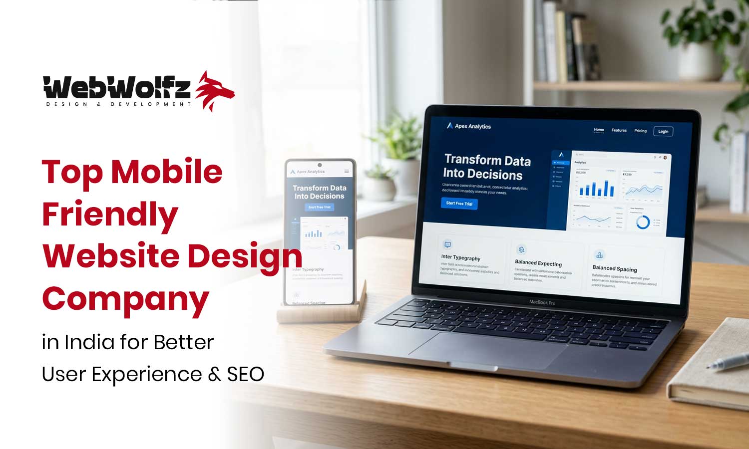
If your website does not work smoothly on mobile, you are losing potential customers every day. This is why choosing a mobile friendly website design company India has become essential for businesses that want to grow online.
A mobile-friendly website is not just about fitting content on a smaller screen. It is about delivering a seamless experience that keeps users engaged and encourages them to take action.
Why Mobile-Friendly Websites Are Essential in 2026
The shift towards mobile usage has completely changed how websites are designed and optimized.
Google now prioritizes mobile-first indexing, meaning your mobile version directly affects your rankings. You can explore this further on https://developers.google.com/search/docs/fundamentals/mobile-first-indexing
If your website is not mobile-friendly, it can lead to:
- High bounce rates
- Poor user experience
- Lower search rankings
- Reduced conversions
A mobile-optimized website ensures that users stay longer and interact more with your content.
What Makes a Website Mobile Friendly
A mobile-friendly website adapts to different screen sizes and provides a smooth browsing experience.
Key features include:
- Responsive layouts that adjust automatically
- Fast loading speed on mobile networks
- Easy navigation with touch-friendly elements
- Readable text without zooming
- Optimized images and media
These elements work together to create a better experience for users.
Difference Between Responsive and Mobile-Friendly Design
Many people confuse responsive design with mobile-friendly design. While they are related, they are not exactly the same.
Responsive design ensures your website adjusts across all devices. Mobile-friendly design focuses specifically on improving the mobile experience.
To understand this better, you can explore:
https://webwolfz.com/blog/responsive-website-design-services-india/
Combining both approaches ensures your website performs well everywhere.
How Mobile-Friendly Design Impacts SEO
Search engines consider mobile usability as a ranking factor.
A mobile-optimized website improves:
- Page speed
- User engagement
- Time spent on site
- Overall SEO performance
Tools like https://pagespeed.web.dev help analyze your website’s mobile performance and suggest improvements.
This is why businesses invest in mobile friendly website design company India to improve both user experience and SEO.
Common Mistakes Businesses Make
Many businesses struggle because they overlook mobile optimization.
Some common mistakes include:
- Using heavy images that slow down loading
- Poor navigation on small screens
- Unreadable text
- Non-responsive layouts
You can explore more mistakes here:
https://webwolfz.com/blog/common-website-design-mistakes-to-avoid/
Avoiding these issues can significantly improve your website performance.
Role of UI UX in Mobile Website Design
User experience plays a major role in how visitors interact with your website.
A good mobile design focuses on:
- Simple navigation
- Clear call-to-action buttons
- Fast loading pages
- Smooth user journey
To understand this better, you can explore:
https://webwolfz.com/blog/why-ui-ux-design-is-important-for-websites/
A well-designed UI UX system ensures users have a positive experience.
How Mobile-Friendly Design Helps Business Growth
A mobile-friendly website is not just a design upgrade. It is a growth tool.
It helps you:
- Reach more users
- Improve engagement
- Increase conversions
- Build trust with customers
In competitive markets, even small improvements in user experience can lead to better results.
Why Choose a Professional Design Company
Creating a mobile-friendly website requires technical expertise and design understanding.
A professional mobile friendly website design company India ensures:
- Proper optimization for all devices
- SEO-friendly structure
- Fast and reliable performance
- Scalable design for future growth
Instead of experimenting on your own, working with experts saves time and effort.
How WebWolfz Makes Website Design Simple
Managing website design on your own can be overwhelming. There are multiple factors involved, from layout to performance optimization.
WebWolfz simplifies this process by offering complete website design and development solutions. Their approach focuses on creating mobile-friendly, user-focused websites that deliver results.
Instead of handling everything yourself, you can rely on a structured process that ensures quality and consistency.
If you want to explore their services, you can visit:
https://webwolfz.com/website-design-development/
Understanding Pricing and Investment
Website design is an investment that supports long-term growth.
The cost depends on:
- Design complexity
- Features required
- Customization level
- Ongoing support
You can explore available plans here:
https://webwolfz.com/pricing-plans/
Choosing the right plan ensures you get value for your investment.
Internal Learning and Resources
If you want to understand website design and SEO in more detail, you can explore:
For specific insights, these resources are helpful:
- https://webwolfz.com/blog/how-to-choose-a-web-design-company-in-india/
- https://webwolfz.com/blog/website-design-vs-website-development-difference/
- https://webwolfz.com/blog/benefits-of-responsive-website-design/
- https://webwolfz.com/blog/technical-seo-vs-on-page-seo/
- https://webwolfz.com/blog/how-seo-helps-small-businesses-grow/
These articles help you understand how design and SEO work together.
Simplifying Website Growth for Business Owners
Running a business already requires time and effort. Managing website design and optimization alongside everything else can be challenging.
Instead of trying to do everything yourself, you can work with professionals who understand what works.
With mobile friendly website design company India, you can focus on your business while experts handle your website performance.
WebWolfz makes this process smooth and efficient by offering complete solutions tailored to your needs.
If you are ready to get started, you can contact them here:
https://webwolfz.com/contact-us/
Final Thoughts
In 2026, a mobile-friendly website is no longer optional. It is essential for success.
Investing in mobile friendly website design company India ensures that your website delivers a better user experience, improves SEO, and supports business growth.
Instead of spending time figuring everything out on your own, you can rely on a team like WebWolfz to handle the entire process.
A well-designed website is the foundation of your digital success.
Frequently Asked Questions
What is a mobile friendly website design company India?
It is a company that creates websites optimized for mobile devices, ensuring better user experience and performance.
Why is mobile-friendly design important?
Mobile-friendly design improves user experience, SEO rankings, and conversion rates.
How does mobile design affect SEO?
Search engines prioritize mobile-friendly websites, which helps improve rankings and visibility.
Can I upgrade my existing website to mobile-friendly?
Yes, most websites can be optimized or redesigned to become mobile-friendly.
Why choose WebWolfz for website design?
WebWolfz provides professional, mobile-optimized website design solutions that improve performance and business growth.