

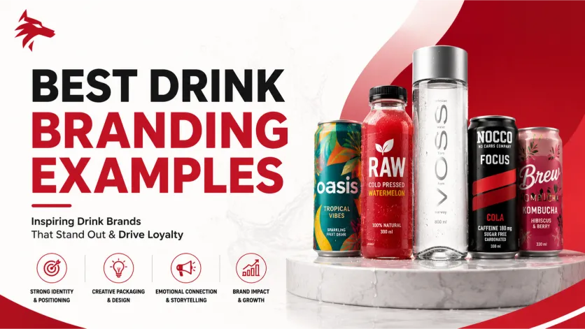
Every great drink is remembered before it’s ever tasted. That’s the strange and slightly unfair truth about the beverage industry: people decide what they trust in the two or three seconds it takes to scan a shelf, a fridge door, or a bar menu. In that window, drink branding isn’t decoration — it’s the entire sales pitch. The colour, the bottle shape, the label, the wordmark, and the ritual of pouring or opening the product all have to do the job that a salesperson would do in any other category.
This is exactly why beverage branding is treated as one of the toughest tests in the design world. A weak logo can hide inside a slow B2B sales cycle. A weak drink label cannot hide anywhere — it has to win in real time, on a crowded shelf, against dozens of near-identical competitors.
In this guide, we’re breaking down the best drink branding examples of all time, the psychology and design principles behind them, and — because packaging is where branding actually lives in this category — a deep dive into beverage packaging and labelling design, including what’s changing in 2026. Whether you’re a founder building a new beverage brand, a designer studying the category, or a business searching for a packaging design agency in India to bring a drink brand to life, this breakdown is built to be a complete, practical reference.
DRINK BRANDING & PACKAGING 2026
Build a Beverage Brand That Consumers Remember
Web Wolfz helps beverage brands create distinctive branding, packaging, flavor positioning, label design, and market-ready products that stand out on retail shelves.
What Makes Drink Branding Successful?
Before naming names, it’s worth asking what actually separates iconic beverage brand design from the forgettable middle of the market. Three ingredients keep showing up.
1. Distinctiveness You Can Recognise in a Split Second
The strongest beverage brand identity systems don’t rely on someone reading a label carefully. They rely on shape, colour, and silhouette recognition. Coca-Cola’s contour bottle is the textbook case — it was engineered so the product could be identified by touch or by shape alone, even in the dark or from a distance. That’s the gold standard for drink packaging and labelling design: recognition before comprehension. The same logic applies to the wordmark and symbol sitting on the label — for a full breakdown of how different mark styles work for drinks brands.
2. Consistency That Compounds Over Time
Good beverage branding isn’t static, but it protects its core assets fiercely while it evolves. Guinness has kept its harp symbol and black-and-cream drama for generations. Budweiser has sharpened its bowtie mark over decades rather than replacing it. This is the difference between a brand that builds equity and one that resets its memory bank with every “refresh.”
3. World-Building Beyond the Product
The best drink brand design examples don’t just look distinctive — they feel like they belong to a specific way of life. Corona isn’t just beer; it’s summer, beaches, and ease. Red Bull isn’t just caffeine; it’s motorsport, extreme sport, and youth culture. This is why beverage branding case studies are studied far outside the drinks industry — they show what happens when packaging design, product experience, and lifestyle positioning are treated as one system rather than three separate jobs.
The Best Drink Branding Examples of All Time
Guinness: Branding as Ritual
Guinness earns its place at the top of almost every list of the best beverage branding examples because it refuses the usual visual language of the category. While most beer and lager brands lean into bright colours, coldness, and speed, Guinness leans into darkness, patience, and ceremony. The near-black pint with its cream head is one of the most recognisable product appearances in any consumer category, and the harp trademark ties the identity permanently to its Irish heritage.
What makes Guinness a masterclass in drink packaging and labelling design isn’t only the visual system — it’s that the brand turned the serving process itself into an asset. The slow pour, the settle, the wait: these aren’t inconveniences, they’re brand theatre. Very few beverage brands manage to make the experience of consumption as distinctive as the pack itself.
Corona: Distinctive Assets Without a Logo
Corona is one of the purest examples of a brand that can be recognised without needing its name at all. A clear bottle, pale liquid, and a wedge of lime instantly signal “Corona” to most consumers, even those with no interest in beer. That’s the power of owning a distinctive brand asset so completely that it survives without a wordmark in sight.
Corona also demonstrates the value of world-building in beverage brand design. The beach, the sun, the ease — these aren’t separate marketing themes bolted onto the product. They’re baked into the packaging: the transparency of the glass, the simplicity of the label, and the lime ritual that turns drinking into a small performance.
Coca-Cola: Structural Design as a Commercial Moat
Coca-Cola’s contour bottle was originally created to stop the brand from being confused with imitators, and it went on to become one of the most famous shapes in commercial history. It’s arguably the strongest case study in how beverage packaging design can function as a legal and commercial defence, not just an aesthetic choice.
What keeps Coca-Cola relevant in any serious discussion of best drink branding examples is coherence across decades and markets — the script, the red-and-white palette, and the curved graphic language all still work together, even as the product range has expanded into diet, zero-sugar, and flavoured variants. It’s a model for how top beverage brands scale packaging and labelling across an entire portfolio without diluting the core identity.
Absolut: The Bottle as a Creative Platform
Since its 1979 launch, Absolut has built its entire identity around one apothecary-style bottle silhouette. What makes this one of the smartest examples of beverage brand identity design is flexibility: the bottle has hosted decades of artist collaborations, limited editions, and campaign reinventions without the core shape ever losing recognisability. Few brands manage to turn packaging into a long-term creative platform rather than a fixed asset — Absolut is the reference point.
Veuve Clicquot: Colour as the Hero Asset
In a luxury category crowded with gold foil, serif type, and heritage cues, Veuve Clicquot made an unusually bold decision: it let colour carry almost all the recognition weight. The Yellow Label does more mnemonic work than most logos manage, letting the brand stand out instantly on a crowded bar or in a supermarket wine aisle. It’s proof that drink packaging and labelling doesn’t need to be complicated to be powerful — sometimes one well-owned colour is the whole strategy.
Angostura: Proof That Eccentricity Can Be an Asset
Angostura bitters looks nothing like a “correctly” designed label — the oversized paper wrap deliberately doesn’t fit the bottle. And that’s exactly why it works. It shows that beverage packaging design doesn’t always need polish to build trust; sometimes a peculiarity, repeated consistently for long enough, becomes a mark of authenticity in itself.
Budweiser: Bold, Mass-Market Asset Branding
Budweiser’s pack architecture is built around big, unmissable cues — most notably the bowtie device. This isn’t subtle branding, and it isn’t trying to be. Mass-market beverage branding doesn’t need a whisper strategy; it needs instant, effortless recall across millions of purchase decisions a day, and Budweiser’s packaging system is engineered exactly for that job.
Energy Drink Branding: The Category That Rewrote the Rulebook
Energy drink branding deserves its own section because it solved a problem the rest of the beverage industry didn’t have to face. Energy drinks arrived in retail without centuries of heritage or cultural ritual to lean on. They had to manufacture instant salience.
Red Bull is the foundational example: a slim can, a silver-and-blue palette, an opposing-bulls symbol, and a positioning built around performance rather than refreshment. Red Bull didn’t just brand a drink — it built a media ecosystem around extreme sport, motorsport, and youth culture that made the packaging feel like the entry point to a much bigger world.
Monster took the same principle in a louder direction: a claw-mark symbol, a black can base, and acid-bright accents pulled visual language from gaming and alternative culture rather than traditional soft drinks. Together, these brands proved that a drink brand design without heritage can still win — as long as the packaging carries a sharp, unmistakable point of view.
More recently, challenger brands like Liquid Death have applied the same logic to bottled water, deliberately rejecting the clean, wellness-coded look of the category in favour of heavy-metal aesthetics on a can. It’s a reminder that in beverage packaging and labelling design, breaking category convention — done with discipline — is often more powerful than following it. If you’re mapping out packaging formats and label materials for an Indian beverage launch, this guide to types of beverage packaging design and this breakdown of beverage label types are useful next reads, since Indian retail shelves, climate, and compliance rules change which formats actually work.
Key Elements of Successful Beverage Brand Design
Across every example above, a small number of principles repeat:
- Compression, not complexity. The strongest systems condense meaning into a handful of disciplined assets — a bottle shape, a colour, a symbol, a ritual — rather than trying to say everything at once.
- Clear brand architecture. Coca-Cola, Absolut, and Veuve Clicquot can all extend into new variants because the core system is stronger than any single flavour or formulation. That’s what separates a scalable beverage brand identity from one that collapses the moment a new SKU is launched.
- Shelf-first thinking. Beverage packaging design has to work at multiple distances — recognisable from across a store, legible up close, and still ownable when compressed into a thumbnail-sized e-commerce image.
- Behavioural branding. The best drink brands don’t just look good — they’re tied to a habit: Corona’s lime, Guinness’s pour, Red Bull’s ecosystem of events and content.
The most common mistakes are just as consistent: chasing design trends at the expense of recognisability, overloading the label with competing messages, copying category codes so closely that the product disappears into a wall of sameness, and treating packaging as a late-stage decoration step instead of a core strategic decision.
How Beverage Packaging and Labelling Design Is Changing in 2026
Packaging and labelling aren’t static disciplines — and 2026 is shaping up to be a genuine turning point for the category. A few shifts matter most for any brand thinking about drink packaging and labelling design right now.
Sustainability is becoming a design requirement, not a marketing add-on. Industry analysis points to a shift from surface-level eco-messaging toward verifiable, data-driven sustainability, with beverage packaging design trends for 2025–2026 emphasizing visual minimalism paired with higher information density, as consumers want to understand product value, origin and environmental impact within seconds. Regulatory pressure is accelerating this: 2026 is expected to be a critical moment when the packaging industry has to address extended producer responsibility, stricter labelling accuracy requirements and faster manufacturing automation all at once.
“Naked” and transparent packaging is on the rise. Brands are stripping back multi-layered labels and metallic inks that interfere with recycling, moving toward minimalist designs using laser-etching directly onto the bottle or water-soluble inks that wash away easily in recycling facilities. Clear bottles and visible ingredients are also being used deliberately to signal freshness and authenticity to increasingly ingredient-conscious buyers.
Smart, connected labels are becoming mainstream. QR codes, NFC tags, and scannable packaging are moving from novelty to standard practice, letting brands deliver messages, games, or special offers just for individual customers by scanning a code or tapping a phone, deepening the connection between packaging and digital brand experience. This is also where packaging strategy starts to overlap with digital strategy — a beverage brand’s website and its packaging increasingly need to tell the same story, which is covered in more depth in this guide to beverage company website design in India.
Structural branding is replacing flat labelling as the differentiator. As shelves get more crowded, brands are turning to embossed textures and sculpted container shapes rather than relying only on printed graphics, since 2026 is shaping up as the year of custom-embossed textures and 3D container bodies as a way to stand out.
Category-specific labelling logic matters more than ever. Energy drink labelling still leans on bright, metallic finishes for shelf impact, while premium spirits and wine labels rely on tactile paper stock and restrained typography to signal heritage and price. Design decisions that work for a soft drink label can actively damage a premium spirit’s positioning — and vice versa. For a category-by-category breakdown of label materials, finishes, and formats commonly used across India.
For any brand entering the market in 2026, this means beverage packaging and labelling design has to satisfy four audiences at once: the consumer scanning a shelf, the regulator checking label accuracy, the retailer assessing shelf efficiency, and the sustainability-conscious buyer checking the fine print.
What These Branding Examples Teach About Building a Strong Beverage Brand
Pulled together, the best drink branding examples of all time point to a few larger lessons for any business building a beverage brand identity today:
- Repetition beats reinvention. No single redesign or campaign builds equity on its own — patient, disciplined reinforcement of the same core assets does.
- Memory outperforms novelty. Consumers reward confident familiarity far more consistently than they reward launch-day reinvention.
- The strongest brands are behavioural, not just visual. A brand that’s tied to a ritual — a pour, a garnish, a way of drinking — is harder to displace than one that only owns a look.
- Breaking category convention, done with discipline, creates lasting distinctiveness. Guinness doesn’t look like conventional refreshment. Red Bull didn’t look like a conventional soft drink. That deliberate difference is often what gives a brand its life.
- Consistency and distinctiveness have to coexist. Too much consistency without edge becomes wallpaper; too much distinctiveness without repetition becomes a one-season stunt.
How to Choose the Right Beverage Branding and Packaging Partner
Studying great beverage branding examples is useful, but most founders eventually hit the same practical question: who actually builds this for a new or growing beverage brand? A few things are worth checking before hiring a branding and packaging design agency for a drinks business:
- Category experience, not just design polish. A portfolio full of nice logos isn’t the same as experience with shelf constraints, FMCG print production, retailer compliance, and how a design actually photographs under supermarket lighting.
- A system, not a single asset. The right partner should be designing a bottle shape, label, colour system, and brand voice together — not a logo in isolation that someone else has to “fit” onto packaging later.
- Packaging-to-digital consistency. In 2026, a beverage brand’s Instagram grid, e-commerce listing, website, and physical shelf presence all need to look like the same brand. If a design partner only thinks in print, that consistency usually breaks.
- A clear process for regulatory and sustainability requirements. Given how fast labelling accuracy rules and sustainability expectations are moving, an agency that treats these as an afterthought is a risk, not a shortcut.
If you’re comparing options, this guide on how to choose the right logo design company walks through seven direct questions worth asking any agency before signing off — most of them apply just as well to a full beverage branding and packaging design agency, not only a logo specialist.
This is exactly where a specialist branding and packaging design agency like Web Wolfz becomes valuable for beverage founders and drinks businesses. Building a brand identity that survives label reprints, new SKUs, retail expansion, and shifting packaging regulations takes more than a nice-looking bottle — it takes a system. Web Wolfz works with beverage and FMCG brands on exactly this problem: strategic beverage brand identity, shelf-ready packaging and labelling design, logo systems that scale across product lines, and the kind of “intelligent bravery” that lets a challenger brand stand out without losing commercial discipline. One example of this in practice is the brand identity Web Wolfz built for Bean Theory, an FMCG coffee brand, where packaging, logo, and brand system were designed as one connected identity rather than separate deliverables.
Beyond the visual identity itself, most beverage founders also need the brand to show up consistently online. Web Wolfz’s graphic design and branding service covers the logo, packaging, and label system end-to-end, while the website design and development service and SEO services help a beverage brand get discovered and convert once the branding is in place — including ranking for the kind of high-intent searches covered in this guide to SEO for beverage brands in India.
Final Thoughts
The truth about beverage branding is that it’s rarely about the biggest budget or the boldest one-off campaign. It’s about identifying the one asset — a colour, a bottle shape, a pouring ritual, a label proportion — that a brand can own so completely it becomes shorthand for the product itself. Guinness owns the pour. Corona owns the lime. Coca-Cola owns the contour. Veuve Clicquot owns the yellow. That’s the real bar for best beverage branding, and it’s achievable at any brand size if the strategy is disciplined from day one.
Whether you’re launching a new drink brand from scratch, refreshing a tired label, or need packaging that’s ready for 2026’s sustainability and labelling requirements, Web Wolfz can help translate these lessons from the world’s best drink branding examples into a system built for your own product — one that’s recognisable in a fridge, credible on a shelf, and built to compound in value for years, not just one launch cycle.
Frequently Asked Questions
What makes beverage branding different from branding in other industries?
Beverage branding has to work at the point of purchase, in seconds, without a salesperson. Most B2B or service brands are judged over a longer sales cycle; a drink is judged the moment it’s picked up off a shelf, so the bottle, can, or label has to do all the persuasive work a website or brochure would normally do elsewhere.
Why do bottle shape and colour matter more than the logo for many drink brands?
Shape and colour are recognised faster than text, and they still work at a distance, in low light, or when a label is partially obscured. Coca-Cola’s contour bottle and Corona’s clear glass with lime are proof that a strong beverage brand identity can survive without anyone reading the wordmark at all.
How much should a new beverage brand budget for packaging and labelling design?
This varies widely by scale, number of SKUs, print finishes, and whether structural (bottle or can shape) design is involved, not just label graphics. A realistic scope conversation with a packaging design agency in India is usually more useful than a fixed number, since a single-SKU soft drink label and a multi-variant spirits range have very different design and production costs.
Do small or new beverage brands need a full packaging design agency, or just a logo designer?
A logo alone rarely solves the shelf problem. Founders launching a new drink brand typically get more value from an agency that designs the logo, label, colour system, and packaging structure together, since these elements have to work as one system on the shelf, not as separate pieces assembled later.
How does packaging design connect to a beverage brand’s website and SEO?
Increasingly, the same visual system and messaging need to carry from the bottle to the website, product photography, and e-commerce listings. Brands that treat packaging and digital presence as separate projects often end up with inconsistent positioning; the strongest beverage brands brief packaging, website design, and SEO together from day one.