

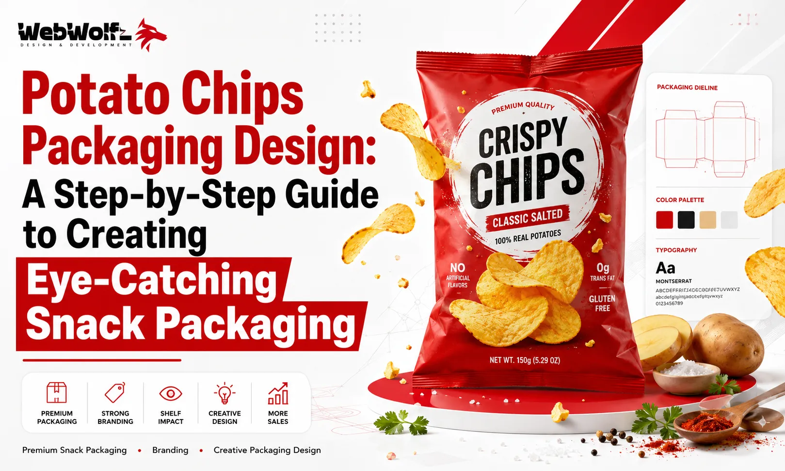
Walk through any supermarket, convenience store, or grocery aisle and you’ll notice one thing immediately. Potato chips compete in one of the busiest packaging categories in the food industry.
Customers are surrounded by dozens of brands offering different flavors, sizes, ingredients, and price points. Since most purchasing decisions happen within just a few seconds, packaging often determines which product gets picked first.
A great chips packet does much more than protect the product. It attracts attention, communicates flavor, builds trust, strengthens brand recognition, and encourages repeat purchases.
This is why investing in professional Potato Chips Packaging Design has become essential for snack brands looking to grow in 2026.
Whether you’re launching a new potato chips brand or redesigning an existing product, this guide explains the essential steps to creating packaging that stands out on crowded retail shelves.
Why Packaging Matters for Snack Brands
Consumers don’t taste your chips before buying them.
Instead, they judge your product based on its appearance.
Your packaging influences:
- First impressions
- Brand perception
- Flavor expectations
- Product quality
- Purchase decisions
- Customer loyalty
Excellent packaging creates excitement before the packet is even opened.
According to Nielsen, packaging continues to be one of the strongest factors affecting consumer buying decisions in retail environments.
For snack brands competing in supermarkets, attractive packaging can become one of the most valuable marketing investments.
What Makes Great Chips Packaging?
Successful packaging combines creativity with strategy.
It should answer three questions immediately:
- What is the product?
- Why should customers choose it?
- What makes it different?
A well-designed packet combines:
- Strong branding
- Attractive colors
- Clear typography
- Premium product photography
- Easy readability
- Functional packaging materials
When all these elements work together, customers develop confidence in the product before tasting it.
Step 1: Understand Your Target Audience
Every successful packaging project starts with research.
Ask questions such as:
- Who will buy this product?
- Children?
- Teenagers?
- Families?
- Health-conscious adults?
- Premium gourmet customers?
Each audience responds to different visual styles.
For example:
Children may prefer playful illustrations and bright colors.
Premium buyers often respond better to minimalist layouts and elegant typography.
Understanding your audience helps every design decision become more effective.
Step 2: Build a Memorable Brand Identity
Customers rarely remember generic packaging.
Instead, they remember brands with distinctive personalities.
Your brand identity includes:
- Logo
- Color palette
- Typography
- Design style
- Messaging
- Visual consistency
Strong branding helps customers recognize your products across multiple flavors and package sizes.
Step 3: Choose Colors That Match the Flavor
Color psychology plays a major role in snack packaging.
Different flavors are often associated with familiar colors.
Examples include:
- Red for Classic Salted
- Green for Sour Cream & Onion
- Orange for Cheese
- Yellow for Butter
- Black for Premium or Spicy Variants
- Purple for Exotic Flavors
Consistent color systems make it easier for customers to identify flavors quickly.
Step 4: Make the Product Name Highly Visible
Customers should identify the product instantly.
Avoid small typography or cluttered layouts.
Instead:
- Use large product names
- Keep strong contrast
- Create clear visual hierarchy
- Maintain generous spacing
The product name should remain readable from several feet away.
Step 5: Use High-Quality Product Photography
Nothing sells food better than appetite appeal.
Professional food photography immediately increases perceived quality.
Show chips that appear:
- Crispy
- Golden
- Fresh
- Well-seasoned
- Crunchy
Supporting ingredients such as herbs, spices, cheese, or vegetables can reinforce flavor expectations.
High-quality visuals create emotional appeal before customers even touch the packet.
Step 6: Highlight Key Selling Points Clearly
Modern shoppers look for more than flavor.
Important claims deserve clear placement on the front of the package.
Examples include:
- Gluten Free
- Baked
- No Artificial Colors
- Vegan
- High Protein
- Non-GMO
- Made with Real Potatoes
- No Preservatives
Simple icons often communicate these benefits more effectively than paragraphs of text.
Design for Retail Shelves, Not Just Computer Screens
Many packaging designs look beautiful on a designer’s monitor but disappear when placed beside competing products.
Always review your packaging at actual shelf size.
Ask yourself:
- Does the logo stand out?
- Is the flavor obvious?
- Can shoppers read the product name quickly?
- Does the packet create curiosity?
If the answer is no, simplify the design.
Large typography, bold branding, and clean layouts generally outperform complicated graphics.
Learn from Other Successful Food Packaging Categories
Studying other food products can generate fresh design ideas.
For example, brands creating popcorn products often use vibrant graphics and playful layouts to communicate excitement.
You can explore additional inspiration in our guide to Popcorn Packaging Design:
https://webwolfz.com/blog/popcorn-packaging-design/
Similarly, premium health snack packaging offers useful lessons in minimalist branding. Our articles on Protein Brownie Packaging Design and Protein Cookie Packaging Design demonstrate how clean layouts and strong visual hierarchy help products stand out.
https://webwolfz.com/blog/protein-brownie-packaging-design/
https://webwolfz.com/blog/protein-cookie-packaging-design/
These examples show that successful packaging always balances creativity with clarity.
Step 7: Select the Right Packaging Material
Your packaging material affects far more than appearance. It influences freshness, shelf life, transportation, durability, and customer perception.
Most potato chips use multilayer flexible packaging because it provides excellent protection against:
- Moisture
- Oxygen
- Sunlight
- Air leakage
- Product breakage
Premium snack brands also focus on high-quality printing surfaces that enhance colors and improve shelf visibility.
The packaging should not only look attractive but also protect the chips until the customer opens the bag.
Step 8: Create a Strong Visual Hierarchy
Customers should understand your product within seconds.
A well-structured package naturally guides the customer’s eyes through the most important information.
A simple hierarchy works best:
- Brand Logo
- Product Name
- Flavor
- Hero Product Image
- Key Benefits
- Weight
- Supporting Information
Avoid placing too many competing elements on the front panel. A clean layout feels more premium and is much easier to understand.
Step 9: Design Every Flavor as Part of One Family
Most potato chip brands offer several flavors.
Although each flavor should have its own identity, customers should instantly recognize that every packet belongs to the same brand.
Maintain consistency in:
- Logo placement
- Typography
- Illustration style
- Layout
- Product photography
- Icon style
Differentiate flavors primarily through color while keeping the overall branding uniform.
This approach strengthens brand recognition over time.
Step 10: Use Packaging Finishes to Increase Premium Appeal
Packaging isn’t just visual. Customers also respond to how it feels.
Popular premium finishes include:
- Matte lamination
- Gloss highlights
- Metallic foil
- Spot UV
- Embossing
- Soft-touch coating
These finishing techniques help products feel more premium without changing the overall design.
Luxury snack brands often use subtle finishing effects instead of overly complicated graphics.
Step 11: Think About Online Shopping
Packaging no longer appears only on supermarket shelves.
Many customers discover snack brands through:
- Amazon
- Shopify stores
- Food delivery platforms
- Grocery apps
- Online advertisements
Your packaging should remain attractive even when viewed as a small thumbnail.
Large typography, strong colors, and simple layouts usually perform better online than busy designs.
Step 12: Consider Sustainable Packaging
Today’s consumers increasingly care about environmental responsibility.
Many snack brands are exploring:
- Recyclable materials
- Lightweight packaging
- Reduced plastic usage
- Eco-friendly inks
- Sustainable production methods
The Sustainable Packaging Coalition provides valuable information about environmentally responsible packaging practices:
https://sustainablepackaging.org/
If sustainability is part of your brand, communicate it honestly without overwhelming the design.
Step 13: Test Before Printing
Many brands rush into production without validating their packaging.
Testing helps identify issues before thousands of packets are printed.
Useful testing methods include:
- Shelf comparison
- Consumer surveys
- Focus groups
- Online mockups
- Retail simulations
Ask participants:
- Which packet attracts attention first?
- Which looks most premium?
- Which flavor seems most appealing?
- Which brand feels most trustworthy?
Even small adjustments can significantly improve sales performance.
The Psychology Behind Great Snack Packaging
Successful packaging appeals to both logic and emotion.
Customers often make quick emotional decisions before justifying them logically.
Effective packaging creates feelings such as:
- Hunger
- Curiosity
- Excitement
- Trust
- Premium quality
- Freshness
Visual cues like crispy chips, seasoning, bold colors, and appetizing photography stimulate appetite almost instantly.
This emotional connection often determines whether a shopper reaches for your packet instead of a competitor’s.
Common Potato Chips Packaging Mistakes
Even quality products can struggle because of poor packaging decisions.
Some of the most common mistakes include:
Too Much Information
Overcrowded packaging confuses customers.
Focus on only the most important information.
Weak Branding
If shoppers can’t remember your brand after seeing the packet, the identity needs improvement.
Consistency builds recognition.
Poor Typography
Fancy fonts often reduce readability.
Simple, bold typography performs much better in retail environments.
Low-Quality Product Images
Unappealing food photography immediately lowers perceived quality.
Professional product photography is one of the best investments a snack brand can make.
Generic Design
Many snack products look nearly identical.
Develop a distinctive visual style that customers can instantly recognize.
Learn From Other Successful Packaging Categories
Many packaging principles apply across multiple food categories.
For example, premium protein snack packaging focuses on communicating health benefits through clean layouts and strong branding.
You can explore our guides on:
Protein Cake Packaging Design
https://webwolfz.com/blog/protein-cake-packaging-design/
High Protein Mini Cake Packaging Design
https://webwolfz.com/blog/high-protein-mini-cake-packaging-design/
Similarly, performance nutrition products prioritize clear communication and benefit-driven layouts. Our Energy Gel Sachet Packaging Design guide offers additional insights into packaging that quickly communicates product value.
https://webwolfz.com/blog/energy-gel-sachet-packaging-design/
Even wellness beverages provide valuable inspiration. Articles such as Collagen Water Packaging Design, Beauty Water Bottle Packaging Design, Hydration Drink Packaging Design, and Electrolyte Drink Packaging Design demonstrate how minimalist layouts and premium branding influence customer perception.
https://webwolfz.com/blog/collagen-water-packaging-design/
https://webwolfz.com/blog/beauty-water-bottle-packaging-design/
https://webwolfz.com/blog/hydration-drink-packaging-design/
https://webwolfz.com/blog/electrolyte-drink-packaging-design/
Studying successful packaging across different product categories often leads to fresh creative ideas while helping your brand remain unique.
Why Professional Packaging Design Matters
Designing packaging for potato chips is about much more than making a packet look attractive.
Successful packaging combines:
- Consumer psychology
- Branding strategy
- Retail merchandising
- Printing expertise
- Material selection
- Color psychology
- Typography
- Food photography
- Marketing strategy
Every design decision should encourage customers to notice your product, trust your brand, and ultimately place it in their shopping cart.
This is why many successful snack brands invest in professional packaging design instead of relying on generic templates.
Packaging Trends for Snack Brands in 2026
Consumer preferences continue to evolve, and packaging trends are changing alongside them.
Some of the biggest trends include:
Minimalist Designs
Modern snack brands are moving toward clean layouts with bold typography and fewer distractions.
Sustainable Packaging
Consumers increasingly appreciate brands that use recyclable materials and environmentally responsible packaging solutions.
Premium Finishes
Matte coatings, spot UV, metallic foils, and embossed logos help products stand out while increasing perceived value.
Transparent Product Windows
Some brands allow customers to see the actual product, helping build trust and showcase freshness.
QR Code Integration
Smart packaging connects customers with recipes, promotional campaigns, loyalty programs, nutritional information, and brand stories through QR codes.
These trends not only improve shelf appeal but also strengthen customer engagement.
Why Packaging Influences Business Growth
Outstanding packaging creates value far beyond retail shelves.
It helps businesses:
- Increase product visibility
- Build stronger brand recognition
- Improve customer confidence
- Support premium pricing
- Encourage repeat purchases
- Strengthen online marketing
- Improve retailer confidence
In highly competitive snack categories, packaging often becomes the deciding factor between two similar products.
A memorable design continues promoting your brand every day without additional advertising costs.
Why Businesses Choose WebWolfz
Creating successful food packaging requires both creativity and strategy.
At WebWolfz, we help food and FMCG brands develop packaging that balances attractive design with commercial performance. Our team focuses on creating packaging that captures attention, communicates product benefits clearly, and strengthens long-term brand recognition.
Whether you’re launching potato chips, popcorn, protein snacks, beverages, coffee products, or functional food items, we create packaging solutions designed for modern retail shelves and online marketplaces.
If you’re looking for more packaging inspiration, you may also find these resources helpful:
Peri Peri Seasoning Packaging Design
https://webwolfz.com/blog/peri-peri-seasoning-packaging-design/
Functional Coffee Packaging Design
https://webwolfz.com/blog/functional-coffee-packaging-design/
CBD Coffee Packaging Design
https://webwolfz.com/blog/cbd-coffee-packaging-design/
Our complete guide to Packaging Design Services for Food Brands explains how strategic packaging can help businesses create stronger market presence and increase customer trust.
https://webwolfz.com/blog/packaging-design-services-for-food-brands/
If you’re planning to launch a new snack product or redesign your existing packaging, our team is ready to help.
https://webwolfz.com/contact-us
Final Thoughts
The potato chips market continues to become more competitive every year, making packaging one of the most important investments a snack brand can make.
Customers often decide which packet to buy within just a few seconds. Strong branding, premium product photography, bold typography, thoughtful color selection, and high-quality materials all contribute to making that decision easier.
Rather than treating packaging as simply a protective wrapper, successful brands view it as a powerful marketing tool that builds trust, strengthens recognition, and drives long-term growth.
By following the step-by-step strategies outlined in this guide, you can create packaging that not only attracts attention but also encourages customers to choose your product again and again.
Frequently Asked Questions
Why is potato chips packaging important?
Packaging creates the first impression, attracts customers on retail shelves, communicates product quality, and influences purchasing decisions before the packet is opened.
What colors work best for potato chips packaging?
Bold colors such as red, yellow, green, orange, black, and blue are commonly used to represent different flavors while increasing shelf visibility and brand recognition.
How can snack packaging increase sales?
Professional packaging improves shelf appeal, builds customer trust, highlights product benefits, strengthens branding, and encourages impulse purchases.
What are the latest snack packaging trends in 2026?
Minimalist layouts, sustainable materials, premium finishes, smart QR codes, bold typography, and distinctive product photography are among the biggest snack packaging trends in 2026.
Should startups invest in professional packaging design?
Yes. Professional packaging helps startups build credibility, compete with established brands, improve shelf visibility, and create a memorable customer experience.
Why choose WebWolfz for food packaging design?
WebWolfz creates premium packaging that combines branding, consumer psychology, retail strategy, and modern design trends to help food brands attract customers and grow their business.