
If you are building a beverage brand in India right now, the one thing that will either make you stand out or blend into shelf noise is your logo. A logo is not just a pretty mark your designer puts together in a few hours. It is the first visual handshake your brand gives to a customer. Before they read a single word on your bottle, they have already formed an opinion based on your logo. And in the beverage category specifically, where choices are made in seconds at a store aisle, that first impression is everything.
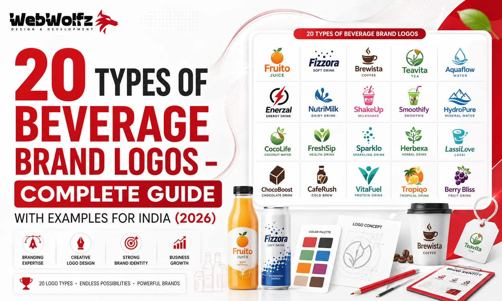
The Indian beverage market has exploded in the last few years. From traditional drinks like Rooh Afza and Frooti to newer functional drinks, hydration multipliers, protein shakes, and craft sodas, the competition on shelf is fierce. Every new brand entering this space needs to think seriously about what kind of logo they want and why. Not all logos are built the same way. There are at least 20 distinct types of beverage brand logos, and each one serves a different purpose, audience, and communication goal.
In this guide, we break all of them down with real Indian examples wherever possible, so you can make an informed decision for your own brand. Whether you are launching a new hydration drink, an electrolyte powder, or a functional beverage, this guide will help you understand which logo style fits your vision.
Before we jump in, if you are also thinking about your packaging and not just the logo, do check out this detailed piece on beverage packaging design which covers the full picture of how visual identity works for drink brands in India.
Why Getting Your Beverage Logo Right in 2026 Matters More Than Ever
In 2026, the Indian consumer is smarter, more visually aware, and spoilt for choice. D2C brands are launching every week. Modern trade shelves are getting more competitive. And e-commerce means your label and logo are being judged on a five-inch phone screen. A generic or rushed logo signals to buyers that the product inside might also be generic. That is a brand kiss of death.
According to branding research, 75 percent of consumers recognize a brand by its logo before they read the name. In a beverage aisle where you have maybe two seconds to grab attention, that percentage becomes extremely important.
The other reason getting your logo right in 2026 matters is the rise of content-driven commerce. Your logo will appear in Instagram reels, influencer unboxings, quick commerce thumbnails on Blinkit and Zepto, and WhatsApp forwards. It needs to work at 500 pixels and at 5 centimetres. Different logo types handle this challenge differently.
The 20 Types of Beverage Brand Logos Explained
1. Wordmark Logo
A wordmark is the purest form of a logo. It is just the brand name set in a custom or distinctive typeface, nothing else. The name itself becomes the visual identity. Coca-Cola is the global gold standard for this. In India, Thums Up uses a stylized wordmark where the typography carries all the energy and boldness the brand stands for. Paper Boat also uses a clean wordmark that communicates nostalgia and simplicity.
Wordmarks work beautifully when your brand name is short, unique, and memorable. If your brand name itself is interesting, a wordmark lets it do the heavy lifting. For new Indian beverage startups with distinctive names, this is often the smartest starting point because it builds name recognition from day one.
2. Lettermark Logo
A lettermark uses just the initials of the brand name. Think IBM or HP globally. In India, you will find lettermarks more commonly in corporate brands and legacy businesses. For a beverage startup, lettermarks can work if your full brand name is too long or complicated to fit cleanly on a can or bottle. The risk with lettermarks for newer brands is that nobody knows what the initials stand for, so you need significant marketing spend to build that association.
3. Pictorial Mark Logo
A pictorial mark is an icon or image that represents the brand without any text. The Apple logo is the most famous example globally. In the beverage space, a pictorial mark is powerful when you want the symbol to be instantly associated with your product category. A water droplet, a leaf, a fruit, or a flame can all become distinctive pictorial marks if designed and used consistently. Limca’s use of blue and lemon-inspired visual elements has historically played into this territory.
4. Abstract Mark Logo
An abstract mark is a geometric or conceptual visual that does not literally depict anything recognizable but communicates a feeling or energy. Nike’s swoosh is an abstract mark. In beverage branding, energy drink brands love abstract marks because they convey motion, power, and dynamism without being literal. Brands like Monster Energy use abstraction brilliantly. For Indian brands in the protein drink or electrolyte drink category, abstract marks are increasingly popular in 2026.
5. Mascot Logo
A mascot logo puts a character at the center of the identity. Think the Amul girl in India, who is technically the mascot for a dairy brand but has become one of the most iconic characters in Indian advertising. In beverages, mascot logos create personality, warmth, and emotional connection. They are especially effective for brands targeting children or family audiences. The risk is that mascots can look dated quickly if not designed with longevity in mind. A well-drawn, timeless character can be a massive brand asset.
6. Emblem Logo
An emblem is a logo where the brand name sits inside a shape, badge, seal, or crest. Starbucks is the global benchmark for this. In India, premium craft beer brands and heritage drink companies often use emblem logos to communicate tradition, trust, and quality. If you are launching a premium herbal drink or an artisanal beverage with a roots-in-India story, an emblem logo can signal all of that without saying a word.
7. Combination Mark Logo
A combination mark is the most commonly used logo type globally and for good reason. It pairs a wordmark or lettermark with a symbol, mascot, or abstract mark. This gives brands flexibility. They can use the full lockup on packaging and the icon alone on social media or merchandise. Frooti in India, with its fruit iconography paired with text, is a classic Indian beverage example of a combination mark. Most successful Indian beverage brands use some form of a combination mark because it scales across so many touchpoints.
8. Monogram Logo
A monogram is a logo built from two or more letters interlocked or designed together as a single visual unit. Louis Vuitton’s LV is the global luxury example. In beverages, monograms appear in premium wine labels, craft gin branding, and luxury water brands. For Indian D2C beverage brands trying to build a premium positioning in 2026, a carefully designed monogram can immediately elevate the perception of the product. The key is in the craft of how the letters are merged and the quality of typeface used.
9. Badge Logo
A badge logo is close to an emblem but is usually more circular, stamp-like, or patch-shaped. Craft beer brands in India like White Owl and Simba use badge-style logos heavily because the format communicates authenticity, craft, and local pride. Badge logos work brilliantly on bottles, cans, and even merchandise like caps and tees. If your beverage brand has a strong story or origin behind it, a badge logo is a great way to wear that story as a visual identity.
10. Vintage or Retro Logo
Vintage logos are designed to look like they have been around for decades, even if the brand is brand new. They draw on heritage aesthetics, hand-lettered type, distressed textures, and warm earthy color palettes. Paper Boat, one of India’s most beloved drink brands, leans into nostalgia throughout its identity including its logo and packaging. The vintage aesthetic is especially powerful for traditional Indian flavors like aam panna, jaljeera, kokum, and similar drinks that carry cultural memory.
In 2026, the trend of brands looking deliberately old is getting stronger. Consumers are fatigued by sleek digital polish and are drawn to designs that feel authentic, human, and rooted.
11. Minimalist Logo
Minimalist logos strip everything down to the absolute essential. No embellishments, no gradients, no complicated illustrations. Just clean lines, negative space, and precise typography. Premium water brands like BISLERI’s premium extensions and several new-age collagen water or beauty water brands coming into India in 2026 use minimalist logos to signal sophistication and purity. A minimalist logo done well looks expensive without costing a fortune to produce.
12. Gradient Logo
Gradient logos use color transitions rather than flat single colors. Instagram popularized the gradient logo concept globally. In beverages, gradient logos are popular for energy drinks, sports nutrition drinks, and hydration drinks because gradients communicate energy, intensity, and dynamism. The challenge with gradient logos is that they can sometimes print poorly on budget packaging or lose their impact in single-color applications. A good designer will build a flat-color version alongside any gradient logo.
13. Illustrated Logo
Illustrated logos feature hand-drawn or detailed illustrative artwork as the main visual element. Think of elaborate fruit illustrations, botanical drawings, or character-based illustrations. These logos take significantly more time and skill to produce but can be extraordinarily distinctive. Indian spice and herbal drink brands often use illustrated logos to communicate ingredient purity and craftsmanship. If you are launching a brand in the functional coffee or wellness beverage space, an illustrated logo can make your product feel like an artisanal product rather than a commodity.
14. Typographic Experimental Logo
This is a wordmark, but pushed to its creative limits. Experimental typography involves custom-designed letters, letters that interact with negative space, letterforms that incorporate the product visually, or entirely bespoke type systems built for a single brand. Appy Fizz went through a packaging redesign (done by Pentagram) that brought custom typography to the center of its identity. The result was a far more ownable and distinctive presence on shelf. For beverage startups willing to invest in custom type work, an experimental typographic logo is one of the most distinctive routes available.
15. Geometric Logo
Geometric logos are built from precise shapes, circles, triangles, hexagons, and lines arranged in a visually satisfying, often symmetrical pattern. They communicate precision, modernity, and science, which makes them particularly popular in the sports nutrition and functional beverage space. New Indian brands in the protein shake and electrolyte powder categories tend to gravitate toward geometric logos because they align with the clinical, science-backed positioning these products need.
16. Negative Space Logo
A negative space logo hides a secondary shape or meaning within the white space of the design. The FedEx arrow is the most famous global example. In beverage branding, negative space logos are considered clever, premium, and memorable. A water drop hidden inside a letter, or a fruit shape formed within an abstract mark, these small design decisions create a logo that rewards the viewer and builds a deeper connection with the brand over time. For a new Indian beverage brand looking to stand out in a crowded market, a smart negative space execution can be a huge differentiator.
17. Cultural or Regional Logo
Cultural logos draw directly from Indian visual traditions. Rangoli patterns, kolam-inspired geometric shapes, folk art motifs, Madhubani patterns, or script from regional languages can all form the basis of a culturally rooted logo. In 2026, as Indian consumer brands are doubling down on local pride and regional identity, cultural logos are becoming more relevant. A brand selling kokum juice from Goa, for example, could build its entire visual identity around Konkani folk art aesthetics and create something truly ownable.
This kind of logo also does extremely well in storytelling contexts, on social media, in packaging inserts, and in brand films. If your beverage brand has a strong regional story, a cultural logo gives you an entire universe to build from.
18. Typographic Seal Logo
This is a variation of the emblem where intricate text, often circling a central image or seal, creates a rich, premium visual. Think old pharmacy stamps or government seals but modernized for a beverage brand. Premium Ayurvedic drink brands, tonic waters, and traditional Indian sherbet brands use this style to great effect. It communicates heritage, trust, and quality at a glance.
19. Hand-Lettered Logo
Hand-lettered logos are made with calligraphy-inspired or brush-lettered custom type, giving the brand an artisanal, human, and crafted feel. These logos look like they were painted by a skilled artist rather than typed on a keyboard. For Indian craft beverage brands, kombucha makers, small-batch kadha brands, and specialty tea brands, hand-lettered logos communicate the care and craftsmanship that goes into the product. The market for these is growing fast as urban Indian consumers seek out authentic, small-batch alternatives to mass-produced drinks.
20. Dynamic or Responsive Logo
A dynamic logo is a logo that changes based on context. It might change color based on the product variant, change shape based on the application surface, or have different versions for light and dark backgrounds, small and large sizes, digital and print uses. Large global brands have been doing this for years but in 2026, even mid-sized Indian beverage brands are building responsive logo systems because their products live across so many surfaces. A can, a pouch, a website banner, an Instagram story, a Blinkit thumbnail, a food delivery platform listing, all of these need slightly different executions of the same identity.
Building a dynamic logo system from the start is a smarter investment than designing one static logo and then scrambling to adapt it later.
How Indian Beverage Brands Are Using These Logos in 2026
Looking at the Indian market specifically, a few patterns are emerging in beverage logo design that are worth understanding. Premium functional beverage brands in categories like hydration multiplier drink mixes, energy gels, and protein drinks are gravitating toward geometric, minimalist, and gradient logo styles. They want to look science-backed and performance-oriented.
Traditional Indian drink brands and heritage brands rebuilding for modern audiences are leaning into vintage, cultural, illustrated, and hand-lettered styles. They want to feel rooted, authentic, and differentiated from global corporate brands.
New D2C startups in the snacking and beverage crossover space, brands that are launching protein snacks alongside beverages or flavoured nuts alongside health drinks, are investing in combination marks and badge logos that can stretch across a product portfolio.
The smart brands understand that logo design does not exist in isolation. It is part of a full packaging system. The logo needs to work with the label layout, the color palette, the typography system, and the information hierarchy on the pack. This is why a deep-dive into food packaging design and beverage packaging design is always recommended before finalizing any logo.
What Makes a Beverage Logo Actually Work in 2026
There are five non-negotiable qualities that separate a logo that works from one that does not.
The first is scalability. Your beverage logo design needs to look sharp at the size of a bottle cap and at the size of a billboard. Test it at both extremes before you approve it. The second is uniqueness. India is full of generic beverage logos with a water drop, a fruit, and a sans-serif font all in blue or orange. If your logo could belong to any other brand, it is not doing its job. The third is color logic. Your logo colors need to work in print, on screen, in foil stamping, and even in single-color versions. Build a color system, not just one version. The fourth is file readiness. A logo should be delivered in vector format (.ai or .eps) so it can scale without losing quality. The fifth is cultural fit. A logo that works in Delhi might not resonate in Chennai or Kolkata. Think about your target market and whether your visual language speaks to them.
If you want professional help getting all five right, it might be worth exploring what a dedicated packaging design agency in India can offer. Agencies like WebWolfz specialize in building complete visual identity systems for food and beverage brands, from logo design all the way to packaging systems, label compliance, and digital-ready assets. Instead of going through ten rounds of revisions with a freelancer or making do with a Canva logo, brands that work with specialists tend to get a logo that actually performs on shelf and in market.
Common Mistakes Indian Beverage Brands Make With Logo Design
Copying a successful brand’s logo style is the most common mistake. When a new energy drink brand uses the same lightning bolt motif and neon color palette as Monster or Red Bull, it signals to buyers that the brand has no original thinking. Buyers in 2026 are perceptive enough to spot a copycat.
Using too many elements is another frequent error. A logo with an illustration, a gradient, a tagline, a border, and two font styles is not a logo, it is a design exercise in over-communication. Good logos are brutally edited.
Ignoring how the logo interacts with the rest of the packaging is a costly mistake too. The logo does not live alone on a white background. It sits on a label with regulatory text, flavor callouts, nutritional information, and brand messaging. If the logo has not been designed with that context in mind, it will fight against the other elements rather than leading them. For brands in the packaging design services for food brands space, this systems thinking is what separates strategic design from superficial aesthetics.
Finally, many Indian brands skip the trademark check. A beautiful logo that cannot be trademarked is a liability. Before you fall in love with your logo, check if the mark or a similar one already exists in your category. This is especially important for brands that plan to expand internationally.
Choosing the Right Logo Type for Your Beverage Brand
The right logo type depends on four things: your brand name, your target audience, your product category, and where your product will primarily be sold.
If your name is short and punchy, a wordmark or typographic logo is your strongest option. If you plan to sell primarily through quick commerce and Instagram, you need something that works at thumbnail scale, which means simple marks, bold typography, and minimal detail. If you are in the premium segment, invest in craft. An illustrated logo, a beautifully rendered emblem, or a precise geometric mark will justify a higher price point visually.
If you are a startup trying to launch fast, at least make sure you invest in a combination mark that can grow with you. Start with the full lockup and build the standalone icon version as your brand grows. For further reading on how packaging design for startups should be approached from a strategic angle, this guide on snack packaging design for startups has useful principles that apply equally to beverage brands.
FAQ
Q1. What type of logo is best for a new beverage brand in India?
For most new Indian beverage brands, a combination mark logo works best. It pairs your brand name with a visual symbol, which helps build both name recognition and visual recall simultaneously. As your brand grows and the symbol becomes recognizable on its own, you can start using it independently.
Q2. How much does beverage logo design cost in India?
Logo design for beverage brands in India can range anywhere from a few thousand rupees with a freelancer to several lakhs with a full-service branding agency. The cost depends on the complexity of the design, the number of concepts, the expertise of the designer, and whether you need a full brand identity system or just a logo. Investing in quality at this stage pays off significantly because redoing a logo after launch is expensive and confusing for customers.
Q3. Should my beverage logo include the product or fruit in the design?
Not necessarily. Many successful beverage brands avoid literal product imagery in their logos and instead communicate through color, typography, and abstract marks. Literal illustrations can work beautifully when done with skill, but they can also look generic if the category is crowded with similar imagery. The decision should be based on differentiation, not convention.
Q4. Can I use the same logo across all my beverage product variants?
Yes, but you will need a flexible logo system. Many beverage brands use the same core logo across variants but change the color of the mark to indicate different flavors or product lines. This approach maintains brand consistency while making it easy for customers to navigate the product range on shelf.
Q5. What is the difference between a logo and a brand identity for a beverage brand?
A logo is a single mark. A brand identity is the complete system: the logo, the color palette, the typography, the iconography, the packaging design, the photography style, and the tone of voice all working together. Many new brands only invest in a logo and then struggle to maintain consistency across their packaging, website, and social media. A complete brand identity system, while a bigger investment upfront, saves enormous time, money, and inconsistency down the line.
Q6. How do I know if my beverage logo will work well on packaging?
Test it in context. Place your logo on a mock-up of your actual bottle, can, or pouch and see how it looks at real size. Check it at small scale like a Blinkit listing thumbnail and at large scale like a shelf talker. Also test it in black and white because some printers and applications will reproduce it that way. If it holds up across all these conditions, it is a strong logo.
Q7. Does WebWolfz do logo and packaging design for beverage brands?
Yes. WebWolfz works with food and beverage brands across India to create full packaging design systems including logo development, label design, and digital-ready brand assets. If you want to see how they approach beverage branding, you can reach them through their contact page or explore their portfolio of work across categories like hydration powder packaging, protein drink packaging, and electrolyte drink packaging.