

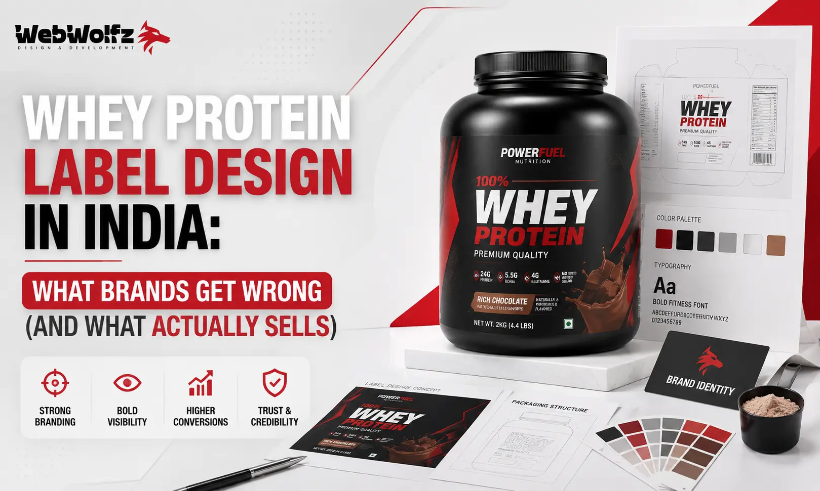
India’s fitness industry is on fire right now. The sports nutrition market crossed the Rs. 3,000 crore mark in 2024 and is growing at nearly 15% every year. Gym memberships are doubling, protein awareness is spreading beyond metros, and a growing number of Indians, from college students to working professionals to homemakers, are actively buying whey protein for the first time. But here is the uncomfortable truth that most supplement brands in India refuse to face: a great product alone does not sell. Your label sells the product before the customer even reads the ingredient list.
Walk into any supplement store or scroll through any marketplace listing and you will see the same problem repeated across dozens of brands. Cluttered tubs, aggressive fonts screaming from every angle, nutrition panels that look like a receipt from a hardware store, and claims so exaggerated that the consumer does not know what to believe anymore. India’s whey protein market is maturing fast, but a massive chunk of the brands operating in it are still designing their labels like it is 2013. Customers have evolved, but many labels have not.
This blog is a deep dive into the most common mistakes Indian brands make in whey protein label design and what the brands that are actually converting buyers are doing differently.
Why Your Whey Protein Label Is a Business Decision, Not Just a Design Choice
Most founders treat packaging as the last step after the product is ready. They spend months on formulation, flavour testing, and pricing, and then rush the label design to a freelancer in the final week before launch. This is one of the most expensive mistakes a supplement brand can make in India.
Think about how a buyer actually encounters your product. On a marketplace like Amazon or Flipkart, your tub thumbnail is competing with fifteen other products on the same screen. In a supplement store, your product sits at eye level next to MuscleBlaze, Optimum Nutrition, and AS-IT-IS. The buyer’s decision to pick it up or click on it happens in under three seconds. Three seconds is what your label has to communicate trust, clarity, and brand identity simultaneously.
Beyond the visual impact, there is a regulatory reality that every Indian brand must respect. The Food Safety and Standards Authority of India sets strict labelling requirements for supplements, covering everything from font size and allergen declaration to nutrition information panels and health claims. Brands that treat FSSAI compliance as an afterthought end up with label rejections, penalty notices, or forced recalls from retail and e-commerce platforms. The legal liability for every word on your label rests with the brand whose name appears on the tub, regardless of who manufactured it.
So when you look at whey protein label design in India, you are really looking at the intersection of consumer psychology, regulatory compliance, shelf competition, and brand trust. Getting all four right is what separates brands that grow from brands that stay stuck in their first fifty units.
The Most Common Mistakes Indian Whey Protein Brands Make on Their Labels
Let us start with what is actually going wrong, because the mistakes are surprisingly consistent across brands of different sizes.
The first and most widespread mistake is information overload on the front panel.
Indian brands, especially new ones, have a tendency to put everything they know about their product on the front face of the tub. You will see the protein content per serving, the flavour name, a list of benefits, the BCAA and EAA breakdown, the ISO certification logo, the lab testing badge, the “zero sugar” callout, and the brand tagline all competing for attention in the same 10×10 centimetre space. The result is visual noise. The consumer sees everything and reads nothing. Premium international brands like Optimum Nutrition have built decades of trust partly because their front panels are clean, with a hierarchy of just three or four key pieces of information: the brand, the product type, the protein content, and the flavour.
The second mistake is choosing aggression over trust.
Dark backgrounds, red and black colour schemes, sharp angular fonts, and aggressive imagery of shredded athletes were the dominant visual language of supplement packaging in the early 2010s. That language still works for a narrow segment of hardcore gym-goers, but it actively alienates the growing majority of Indian buyers who are not bodybuilders. A large portion of today’s whey protein buyers are women, students, and working professionals who want to look and feel healthier. If your label looks like it belongs in an extreme fighting event, you are losing a significant chunk of the market before the conversation even starts.
The third mistake is weak nutritional panel design.
Many brands list their nutrition information in fonts so small and formatting so poor that reading it feels like a chore. Yet in today’s market, informed buyers actively read the nutrition label before purchasing. A 2023 investigation found that several popular Indian whey protein brands had actual protein content well below their label claims. This has made consumers significantly more careful about verifying what they are buying. Your nutrition panel needs to be clearly formatted, easy to scan, and in full compliance with FSSAI’s Labelling and Display Regulations 2020, which specify minimum font heights, contrast ratios, and the mandatory placement of certain information on the front-of-pack panel.
The fourth mistake is ignoring the e-commerce context entirely.
A tub designed for physical retail often looks completely different when photographed and uploaded to an online marketplace. The colours shift, the fine print becomes unreadable at thumbnail size, and the overall visual hierarchy breaks down. With a growing proportion of supplement sales now happening online, your label must be designed to look sharp in a 200×200 pixel listing thumbnail and also hold up at full resolution when a buyer zooms in. This requires deliberate design thinking that many brands and their designers simply are not applying.
The fifth mistake is making health claims that create legal and trust problems simultaneously.
Phrases like “clinically proven,” “medically tested,” “guaranteed muscle gain,” or specific performance claims that cannot be substantiated are not just misleading. They are non-compliant under FSSAI regulations. Beyond the regulatory risk, they damage trust with increasingly savvy buyers. The smarter move is transparent, honest labelling that shows third-party testing badges and clear nutritional information. Brands like AS-IT-IS Nutrition have built strong reputations in India specifically on the promise of clean, transparent labelling, and their growth reflects how well that approach resonates with today’s consumer.
What Actually Converts Buyers: The Design Principles That Work in India’s Market
Understanding what not to do is useful. Understanding what actually works is where the real money is.
The most successful whey protein labels in India today share a set of design characteristics that are worth studying carefully. The first is a clear visual hierarchy on the front panel. The best labels follow a simple rule: one thing should be the loudest, one thing should be the second loudest, and everything else should be quieter. Typically, the brand name carries the most visual weight, followed by the product type and protein content per serving, and then the flavour. Everything else, including certifications, benefits, and taglines, belongs on the sides or back of the tub.
Colour strategy is the second differentiator. Rather than defaulting to the tired black-and-red gym palette, brands that are growing fastest in India are using clean, confidence-inspiring colour systems. Deep navy, forest green, matte white, and warm neutrals are performing well because they communicate quality, cleanliness, and trust without alienating the broader audience. Different flavour variants are increasingly being distinguished through colour coding, which helps buyers navigate quickly in both retail and e-commerce contexts. If you are working on protein shake packaging design or protein drink packaging design, colour strategy is one of the first decisions that needs locking in.
Typography is the third area where Indian brands consistently underinvest. Fonts matter more than most founders realise. A label that uses three or four different font families across different sections looks disorganised and untrustworthy, even if the buyer cannot articulate exactly why. The best supplement labels use a two-font system: a strong display font for headlines and a clean, readable sans-serif for body text. This alone creates a sense of professionalism that many Indian labels are currently missing.
Trust signals are the fourth component that converts. Today’s supplement buyer in India has been burned enough times by misleading labels that they actively look for markers of authenticity. Third-party testing badges, QR codes linking to lab reports, FSSAI license numbers displayed prominently, and batch-specific authentication features are no longer nice-to-haves. They are expectations. Brands that display these elements clearly on their labels consistently outperform those that do not, especially in the premium segment above Rs. 2,000 per kg.
The fifth element is flavour storytelling. This sounds abstract but it has very practical applications. A label for a chocolate-flavoured whey protein can use rich cocoa browns with a textured illustration of cacao pods to communicate an indulgent, premium taste experience before the buyer has ever opened the tub. A mango-flavoured variant can use bright, sun-drenched yellows that feel joyful rather than clinical. These visual cues create expectation and excitement in a way that just writing “Mango Flavour” in plain text never will. The same principle applies across the broader category, from protein brownie packaging design to protein cookie packaging design, where flavour identity on the pack is a direct conversion driver.
The FSSAI Compliance Layer That Most Designers Ignore
No matter how beautiful your label is, if it fails FSSAI compliance, it fails on retail shelves and e-commerce platforms. This is a non-negotiable reality for every supplement brand in India, and yet audits consistently find that over 90% of early-stage food and beverage brands in India fail at least four label compliance checks before launch.
Here is what FSSAI actually requires on a whey protein label that most designers and brands miss. The product name must be accurate and not misleading about the nature of the supplement. Ingredients must be listed in descending order of proportion. The nutritional information panel must use specific formats and minimum font sizes as defined under the Labelling and Display Regulations 2020. Allergen declarations, particularly for dairy, must be clearly visible. The veg or non-veg symbol and the net quantity must appear on the principal display panel, which is the front face of the tub. The FSSAI license number, manufacturer and packer details, manufacturing date, and best-before date are all mandatory. Health claims must be substantiated and cannot promise specific medical outcomes.
What makes FSSAI compliance particularly tricky for supplement brands is the interaction between design and compliance. A designer who is not briefed on regulatory requirements will often place elements based on visual appeal alone, pushing mandatory information to where it looks cleanest rather than where it is legally required to be. The legal liability for this falls entirely on the brand, not the designer. This is why packaging for protein snacks, protein desserts, and hydration powders all require compliance-first design workflows, not design-first-compliance-later ones.
How Indian Supplement Brands Can Build a Label That Sells and Complies
The brands that are winning in India’s supplement market right now are not necessarily the ones with the biggest budgets. They are the ones that have invested in understanding what their buyer actually looks at, what makes the buyer trust them, and what the regulator requires of them before a single tub ships.
Start with your buyer persona before opening any design software. Who is buying your whey protein? If it is a 22-year-old college student in Pune who buys on Amazon, the design priorities are different from a 35-year-old working professional in Bangalore who walks into a supplement store. The visual language, colour palette, and hierarchy of information on your label should reflect a specific buyer’s psychology, not a generic “fitness audience.”
Next, lock in your key claims before the design starts. What is your protein content per serving? What makes your formulation different? Is it the source of whey? The absence of certain additives? Third-party testing? These claims need to be accurate, FSSAI-compliant, and verifiable before they go on the label. Once you know what you are saying, the design process of saying it clearly becomes far more focused.
Then work on visual identity as a system, not just a single label. Your tub, your inner sachets, your shipping boxes, and your e-commerce listing images all need to feel like they belong to the same brand. This is particularly relevant as the supplement category moves toward multi-SKU ranges with isolates, concentrates, mass gainers, and now adjacent products like electrolyte powders and protein muffins. A strong design system handles all of these without looking inconsistent.
Consider getting a pre-launch label audit from a regulatory professional. This single step saves most brands from costly rework after printing thousands of units. The most common label rejection reasons, according to FSSAI compliance experts, include missing allergen information, incorrect nutrition values, misleading claims, wrong license numbers, and improper font size or contrast. None of these require expensive fixes if caught before print. All of them are expensive and embarrassing if caught after.
What Successful Brands Are Doing That You Can Replicate
Looking at what is working in the Indian supplement market gives you a practical framework for your own label. AS-IT-IS Nutrition built its entire brand identity around transparency. Their packaging uses clean, minimal design with large, readable nutrition panels and a “no proprietary blends” promise that is clearly communicated on the label. This approach was unusual in India when they launched, but it became a strong differentiator because the market was full of cluttered, claim-heavy labels. Buyers who were tired of being misled found AS-IT-IS’s straightforwardness refreshing, and the brand grew rapidly through word of mouth and trust.
MuscleBlaze, on the other hand, uses a different approach that works for a different buyer. Their labels are more energetic, with strong use of orange and black, bold typography, and an emphasis on performance claims that resonate with competitive gym-goers. Their colour-coded flavour system makes it easy for repeat buyers to find their variant quickly, both in retail stores and in online listings. The design language communicates energy and intensity, which aligns with their core buyer’s self-image.
What both these successful brands share, despite their different aesthetics, is design intentionality. Every element on their labels is there for a reason. Nothing is accidental, nothing is generic, and the design system holds up consistently across their full product range.
Smaller and newer brands entering the Indian supplement market often try to imitate the visual language of international brands without understanding the underlying design logic. They end up with labels that feel like imitations rather than originals, which is a trust killer in a category where authenticity matters enormously. If your buyer suspects your brand is trying to look like something it is not, the purchase does not happen.
The supplement category is also increasingly converging with other functional nutrition segments. Buyers who purchase whey protein are also interested in protein cakes, high protein mini cakes, energy gel sachets, and collagen water. Brands building in this space need a consistent visual identity across their entire portfolio. The label design philosophy that works for your whey protein tub needs to extend naturally to every SKU you launch.
The Real Cost of Getting Label Design Wrong
Let us talk about what a poor label actually costs you. The most obvious cost is print waste, when you have to reprint because of compliance errors or because the label simply is not converting. But the more significant cost is opportunity cost. Every month your product sits on a shelf or in a marketplace listing with a weak label is a month where a buyer who would have purchased chose a competitor instead.
Returns and negative reviews in the supplement category are often driven by expectation mismatch, and expectation is set almost entirely by the label. If your label uses impressive-looking fonts and aggressive claims but the actual product experience is average, you will get negative reviews. If your label undersells your product with poor design despite having an excellent formulation, buyers will not discover how good it actually is.
The cost of professional packaging design is often a fraction of what brands spend on marketing to drive traffic to listings that then fail to convert. Investing in a strong label design is arguably the highest-ROI spend available to a supplement brand in India right now, because it works twenty-four hours a day on every platform where your product appears.
Brands looking for comprehensive packaging solutions for supplements and functional food products often spend months trying different freelancers with inconsistent results. A more efficient approach is working with a specialist packaging design agency that understands both the visual strategy and the compliance requirements specific to India’s supplement market. WebWolfz works with food and supplement brands to create label and packaging systems that are designed to convert in India’s market while staying within FSSAI guidelines. If you want to see what that looks like in practice across other categories, their work on food packaging design and snack packaging design for startups gives you a good sense of the approach. Instead of spending months testing different designers, many brands find it more efficient to choose the right packaging design agency in India from the start.
Thinking Beyond the Tub: Label Design as Brand Strategy
Your whey protein label is not an isolated piece of design. It is the foundation of how your brand communicates with the market. Every decision you make on the label, from the colour palette to the font choice to the hierarchy of claims, creates expectations that your broader brand identity either fulfils or betrays.
The brands that grow beyond their first product line are the ones that think about label design as brand strategy from day one. When they launch their next product, whether it is a hydration drink, an electrolyte drink, or a functional coffee, the design language extends naturally because the system was built to scale.
This is also why investing in good design early pays dividends beyond the first tub. A well-designed label creates brand equity. When buyers see your product on a shelf they have not visited before, or in a listing on a platform they do not usually use, they recognise the brand and associate it with the positive experience they had before. That recognition is impossible to buy through performance marketing alone. It has to be earned through consistent, high-quality visual identity.
For supplement brands that are serious about building a lasting business in India’s growing fitness market, whey protein label design is not a box to check. It is a strategic investment that shapes every buyer interaction your brand will ever have. Whether you are launching your first SKU or redesigning an existing product line, the question is not whether to invest in good design. It is whether you have the right partners to help you get it right the first time.
If you are building a supplement or functional food brand and want to explore what a complete packaging design system looks like, WebWolfz offers packaging design services tailored for food and health brands in India. You can explore their approach to packaging design services for food brands or get in touch directly to discuss your brand’s specific needs.
FAQ: Whey Protein Label Design in India
Q1. What are the mandatory elements required on a whey protein label in India?
As per FSSAI’s Labelling and Display Regulations 2020, every whey protein label in India must include the product name, net quantity, list of ingredients in descending order of proportion, nutritional information per serving and per 100g, allergen declarations, the FSSAI license number, the manufacturer and packer’s name and address, the batch number, the manufacturing date, and the best before date. The veg or non-veg symbol and net quantity must appear on the primary display panel, which is the front of the tub.
Q2. Why do most Indian supplement brands fail FSSAI label audits?
According to compliance experts who audit early-stage food and beverage brands in India, the most common reasons for label rejection include missing allergen declarations, incorrect nutritional values, misleading or unsubstantiated health claims, wrong FSSAI license numbers, improper font sizes, and mandatory information placed in non-compliant locations on the pack. Most of these errors happen because brands finalise design before consulting compliance requirements.
Q3. How does label design affect online sales of whey protein in India?
On marketplaces like Amazon and Flipkart, your product thumbnail is the first thing a buyer sees. A label designed only for physical retail often loses significant visual impact at thumbnail resolution. Strong label design for e-commerce needs to ensure that the brand name, protein content, and flavour are all legible even at 200×200 pixel size, while also holding up under scrutiny when a buyer zooms in to check ingredients and claims.
Q4. What design mistakes should a new whey protein brand in India avoid?
The most common mistakes include overcrowding the front panel with too many claims, using aggressive visual aesthetics that alienate non-gym buyers, neglecting typography consistency, ignoring e-commerce display requirements, and making health claims that are either unverifiable or non-compliant with FSSAI regulations. Rushing the design process to meet launch deadlines is often the root cause of all of these mistakes.
Q5. How much does professional whey protein label design cost in India?
The cost varies significantly depending on the agency or freelancer and the scope of work. Basic label design from a freelancer can range from Rs. 5,000 to Rs. 25,000, while a full packaging system from a specialist agency, including compliance consultation, multiple SKUs, and e-commerce optimisation, typically ranges from Rs. 30,000 to Rs. 1,50,000 or more. Given that a poor label can cost a brand far more in lost sales and reprint costs, most growing supplement brands find that investing in professional design from the start is the more economical choice.
Q6. How does flavour impact whey protein label design?
Flavour is one of the primary buying decisions in the supplement category. Buyers who are choosing between chocolate, mango, and vanilla variants need to be able to identify their preferred option quickly in both retail and online contexts. Strong label design uses colour coding and visual storytelling to communicate the flavour experience before the buyer reads a single word, making it easier to navigate and reducing friction in the purchase decision.