

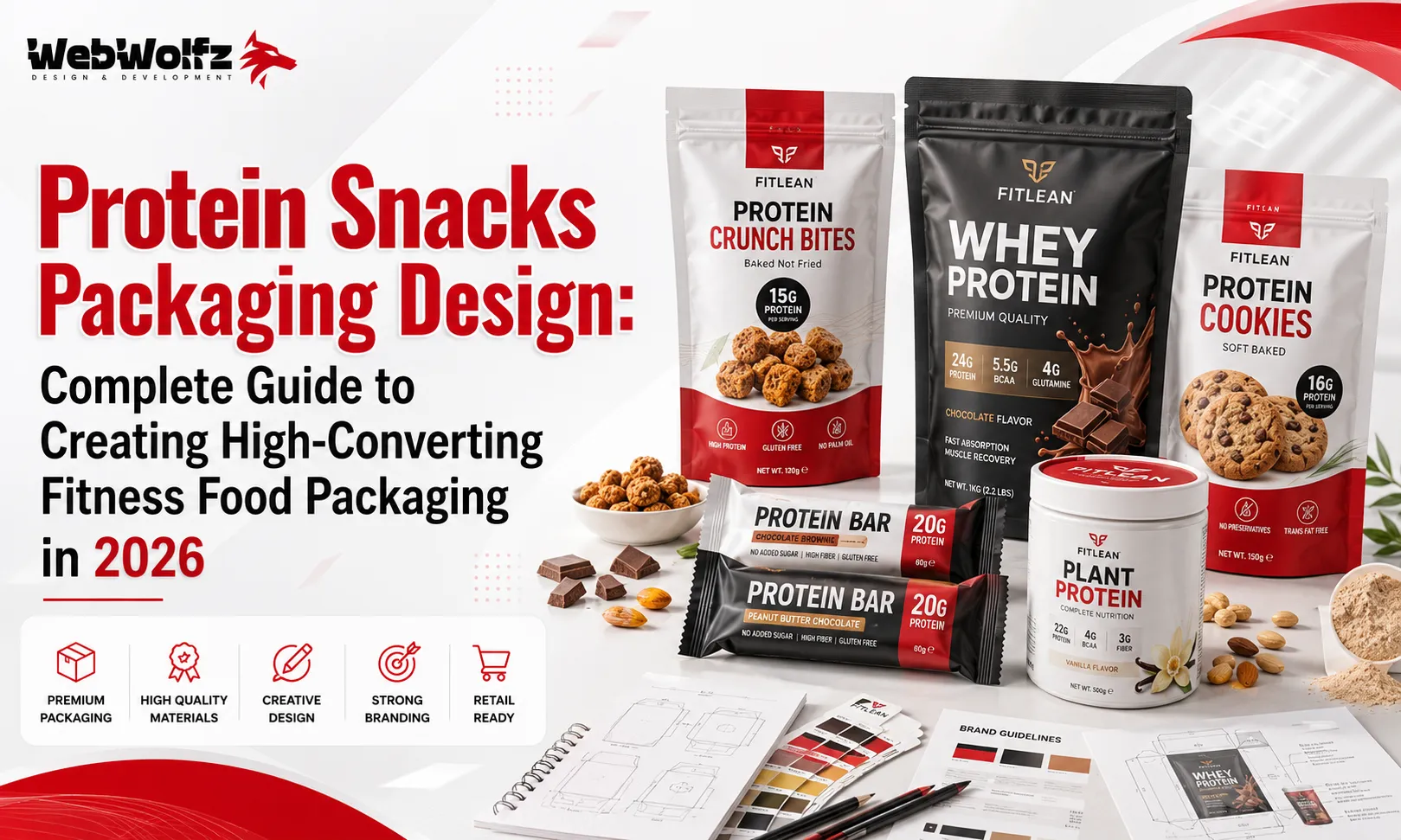
The global fitness nutrition industry is growing faster than ever. Consumers today are actively searching for healthier alternatives to traditional snacks, creating enormous opportunities for brands selling protein cookies, brownies, cakes, nutrition bars, roasted snacks, hydration products, and functional foods. However, the shelves are becoming increasingly crowded, making it harder for new products to capture attention.
This is where professional Protein Snacks Packaging Design becomes one of the most valuable investments a brand can make.
Packaging is far more than a protective wrapper. It is often the first conversation between your product and a potential customer. Before someone reads the nutrition facts or tastes your product, they judge its quality based on how it looks. In just a few seconds, your packaging communicates trust, taste, health, premium quality, and brand personality.
Whether your products are sold in supermarkets, gyms, nutrition stores, health cafés, Amazon, or your own online store, attractive packaging directly influences buying decisions.
In this complete guide, you’ll learn what makes fitness food packaging successful, which design trends are dominating 2026, and how to create packaging that not only attracts attention but also converts shoppers into loyal customers.
Why Packaging Matters More Than Ever
The health food market has changed dramatically over the last few years. Customers no longer purchase products based solely on price. They evaluate ingredients, nutritional value, sustainability, convenience, and overall brand experience.
Packaging influences every one of these decisions.
Research published by Nielsen has consistently shown that packaging significantly affects purchasing behavior, especially in highly competitive FMCG categories.
For protein snacks, packaging should immediately answer four questions:
- What is this product?
- Why is it healthier than alternatives?
- Why should I trust this brand?
- Why should I buy it instead of another one?
If customers can answer those questions within a few seconds, your chances of making a sale increase considerably.
Understand Your Fitness Audience First
Before creating packaging, understand who will buy your product.
Different customer groups expect different visual styles.
For example:
- Gym enthusiasts prefer bold, performance-driven designs.
- Busy professionals often choose clean and premium packaging.
- Athletes usually focus on nutritional information.
- Young consumers appreciate modern, Instagram-friendly branding.
- Families often prefer approachable and trustworthy packaging.
The most successful brands design specifically for their target audience rather than trying to appeal to everyone.
Create a Strong Brand Identity
Customers remember brands before they remember products.
A strong visual identity includes:
- Memorable logo
- Consistent typography
- Recognizable colors
- Unique illustration style
- Professional layout
Whether someone purchases your protein brownie today or your protein cookie next month, they should instantly recognize both products as belonging to the same brand.
If your company plans to expand into multiple fitness products, maintaining a consistent visual identity becomes even more important.
For example, brands developing protein desserts may find inspiration in our guide to Protein Dessert Packaging Design: https://webwolfz.com/blog/protein-dessert-packaging-design/
Choose Colors That Reflect Performance
Color psychology plays a significant role in fitness branding.
Popular choices include:
- Black for strength
- White for purity
- Blue for hydration
- Red for energy
- Green for natural ingredients
- Yellow for optimism
Instead of using every color available, select a focused palette that strengthens recognition across your complete product range.
Premium brands often use only two or three primary colors while allowing flavor variants to introduce subtle accent colors.
Simplicity Creates Premium Packaging
One of the biggest mistakes brands make is trying to communicate everything on the front of the pack.
Customers don’t read paragraphs while standing in a supermarket aisle.
Instead, focus on a clear visual hierarchy.
The front should immediately display:
- Brand name
- Product name
- Key benefit
- Protein amount
- Flavor
Everything else can appear on the side or back panels.
Minimal packaging often performs better because it reduces confusion and builds trust.
Highlight Benefits Instead of Features
Consumers buy outcomes, not ingredients.
Instead of simply writing:
“Whey Protein”
communicate benefits such as:
- 20g Protein
- High Protein Snack
- Supports Muscle Recovery
- Low Sugar
- High Fiber
- Energy On The Go
These statements help shoppers quickly understand why the product fits their lifestyle.
Use Premium Photography Carefully
Many protein snack brands rely on delicious product photography.
If you choose photography, ensure it looks realistic and premium.
Poor-quality images reduce trust immediately.
Some luxury brands instead prefer high-end illustrations or minimalist packaging, allowing typography and color to become the hero.
Choose one direction and stay consistent.
Design for Retail Shelf Visibility
Your packaging competes against dozens of similar products.
Ask yourself one important question:
Can someone identify your product from several feet away?
Large typography, bold contrast, and recognizable colors help improve shelf visibility.
Avoid overcrowding the design with unnecessary graphics.
If customers cannot quickly identify the product category, they often continue walking.
Make Nutrition Information Easy to Read
Today’s fitness consumers spend time reading labels.
Important information should be easy to find:
- Protein content
- Calories
- Sugar
- Carbohydrates
- Fiber
- Ingredients
Well-organized nutrition panels increase confidence and encourage purchases.
Think Beyond Physical Stores
Many protein snacks are now sold online.
That means your packaging also needs to perform well in:
- Amazon listings
- Shopify stores
- Instagram Shops
- Fitness marketplaces
- Mobile screens
Simple designs with bold typography generally perform better in small product thumbnails than complicated artwork.
If you’re expanding into ready-to-drink nutrition products, our Protein Shake Packaging Design and Protein Drink Packaging Design guides provide additional inspiration for maintaining consistent branding across beverages and snacks.
Likewise, brands developing bakery-based fitness products may also benefit from our articles on Protein Brownie Packaging Design, Protein Cookie Packaging Design, Protein Cake Packaging Design, and High Protein Mini Cake Packaging Design, which explore how packaging can remain consistent across multiple product categories while giving each item its own distinct shelf identity.
Build Packaging That Customers Remember
Successful fitness brands do not rely only on attractive graphics. They create packaging that customers can recognize instantly, even from a distance.
Consistency is the key.
Every product in your range should share the same visual language through:
- Logo placement
- Typography
- Color palette
- Icon style
- Layout structure
- Photography or illustration style
When a customer enjoys one product, they should immediately recognize the rest of your product line on the shelf.
Use High-Quality Packaging Materials
Packaging quality directly influences perceived product quality.
If your protein snack is positioned as a premium fitness product, low-quality packaging materials can reduce customer confidence before they even taste the product.
Popular material choices include:
- Matte laminated stand-up pouches
- Metalized barrier pouches
- Recyclable mono-material films
- Resealable zipper pouches
- Premium flexible packaging
For products that require freshness over a longer shelf life, selecting the correct barrier material is just as important as the visual design.
Convenience Drives Repeat Purchases
Modern consumers prefer products that fit into busy lifestyles.
Convenient packaging features include:
- Easy-open tear notches
- Resealable zippers
- Lightweight pouches
- Portable sachets
- Single-serving packs
Good packaging continues delivering value even after the customer leaves the store.
Make Sustainability Part of Your Brand
Eco-friendly packaging has become an important purchasing factor, especially among younger consumers.
Brands are increasingly adopting:
- Recyclable packaging
- Reduced plastic usage
- Water-based inks
- Compostable materials
- FSC-certified paper packaging
If sustainability is one of your brand values, communicate it clearly without overcrowding the design.
The Sustainable Packaging Coalition offers valuable guidance for businesses exploring environmentally responsible packaging.
https://sustainablepackaging.org/
Create Flavor Recognition Without Losing Brand Consistency
Most protein snack brands offer multiple flavors.
Chocolate, Vanilla, Peanut Butter, Salted Caramel, Cookies & Cream, Coffee, Berry, and Mixed Nuts should each have their own identity while remaining visually connected.
An effective approach includes:
- Consistent layouts
- Fixed logo placement
- Shared typography
- Different accent colors for each flavor
Customers should instantly recognize the brand while easily identifying their preferred flavor.
Packaging Should Tell a Story
Today’s consumers connect with authentic brands.
A short message explaining:
- Why your brand exists
- Your nutritional philosophy
- Ingredient sourcing
- Manufacturing standards
- Quality commitment
can help build emotional connections with customers.
Storytelling transforms packaging from a label into a brand experience.
Use Smart Icons Instead of Long Paragraphs
Consumers often scan packaging instead of reading every word.
Simple icons communicate benefits much faster.
Examples include:
- High Protein
- Low Sugar
- Gluten Free
- High Fiber
- Keto Friendly
- Vegan
- Non-GMO
Icons improve readability while creating a cleaner overall design.
Design for Social Media
Packaging is no longer viewed only in supermarkets.
It appears in:
- Instagram posts
- Fitness influencer videos
- YouTube reviews
- TikTok content
- Online advertisements
Products with visually attractive packaging receive more user-generated content, helping brands grow organically.
Ask yourself:
Would someone enjoy photographing this product?
If the answer is yes, your packaging is already working beyond the retail shelf.
Consider the Entire Product Family
Many successful brands eventually expand into related categories.
For example:
- Protein cookies
- Protein brownies
- Protein cakes
- Protein drinks
- Hydration powders
- Energy gels
Creating a scalable packaging system from the beginning saves significant redesign costs later.
If your brand plans to expand into sports nutrition, our Hydration Powder Packaging Design, Electrolyte Powder Packaging Design, and Energy Gel Sachet Packaging Design guides provide useful inspiration for maintaining visual consistency across multiple product categories.
Learn From Other Successful Snack Categories
Many packaging principles apply across multiple food products.
Studying successful snack packaging can reveal ideas for:
- Shelf visibility
- Color hierarchy
- Product photography
- Material selection
- Typography
Our packaging guides for Snack Packaging Design for Startups, Roasted Nuts Packaging Design, Makhana Packaging Design, Potato Chips Packaging Design, Popcorn Packaging Design, and Flavoured Nuts Packaging Design demonstrate how different snack categories use design to influence buying decisions while maintaining strong brand recognition.
Stay Ahead of Packaging Trends in 2026
The fitness nutrition industry continues evolving rapidly.
Leading packaging trends include:
- Minimalist layouts
- Transparent ingredient communication
- Premium matte finishes
- Sustainable materials
- Smart QR codes
- Interactive packaging
- Personalized branding
- Clean typography
- Digital-first packaging
Following trends is valuable, but they should always support your brand identity rather than replace it.
Timeless packaging generally delivers better long-term results than designs that rely only on temporary trends.
Common Packaging Mistakes to Avoid
Even high-quality products can struggle if packaging creates the wrong first impression.
Some of the most common mistakes include:
- Too much text on the front
- Weak visual hierarchy
- Inconsistent branding
- Low-quality product photography
- Poor typography
- Generic stock graphics
- Confusing flavor differentiation
- Cheap packaging materials
Avoiding these mistakes helps strengthen customer trust and improve shelf performance.
Packaging Is an Investment, Not an Expense
Many startups try to reduce costs by using generic packaging templates.
However, professional packaging often delivers long-term value by:
- Increasing shelf visibility
- Supporting premium pricing
- Improving brand recognition
- Encouraging repeat purchases
- Strengthening customer loyalty
Well-designed packaging continues marketing your brand every day without additional advertising costs.
Why Professional Packaging Design Delivers Better Results
Creating successful fitness food packaging requires much more than attractive graphics. Every design decision should help customers understand the product quickly, trust the brand, and feel confident about making a purchase.
Professional packaging designers consider several important factors before creating the final artwork, including:
- Consumer psychology
- Shelf visibility
- Brand positioning
- Material selection
- Printing techniques
- Food safety regulations
- Packaging durability
- Retail merchandising
- Digital marketing compatibility
When these elements work together, packaging becomes a powerful sales tool rather than just a protective wrapper.
If your product range also includes frozen snacks, savory seasonings, or hydration beverages, maintaining a consistent brand identity across all categories helps customers recognize your products more easily. For example, brands expanding into frozen foods can take inspiration from Frozen French Fries Packaging Design, while seasoning products can benefit from ideas shared in Seasoning Pouch Packaging Design and Peri Peri Seasoning Packaging Design.
Similarly, beverage brands looking to build a complete wellness product line may find useful insights in our guides on Hydration Multiplier Drink Mix Packaging Design Trends 2026, Hydration Drink Packaging Design, Electrolyte Drink Packaging Design, Collagen Water Packaging Design, Beauty Water Bottle Packaging Design, CBD Coffee Packaging Design, and Functional Coffee Packaging Design. Although these products target different audiences, they all rely on strong branding, premium presentation, and consistent visual identity.
Why Many Food Brands Choose WebWolfz
Launching a successful protein snack brand requires a balance of creativity, strategy, and technical expertise.
At WebWolfz, we create packaging that does more than look attractive. We design packaging that communicates quality, strengthens brand identity, improves shelf visibility, and supports long-term business growth.
Whether you’re introducing protein snacks, functional beverages, healthy desserts, sports nutrition products, or an entirely new food brand, our team develops packaging solutions tailored to your target audience and retail environment.
If you need complete support for your next product launch, explore our Packaging Design Services for Food Brands to see how strategic packaging can help your products compete more effectively in today’s market.
If you’d like to discuss your packaging project or receive a custom design consultation, our team is always ready to help.
https://webwolfz.com/contact-us
Final Thoughts
The fitness food industry is growing rapidly, but customer expectations are growing just as quickly.
Today’s consumers want products that not only deliver nutritional value but also reflect quality, trust, and professionalism from the very first glance. Packaging is often the deciding factor that influences whether someone picks up your product or chooses a competitor instead.
By focusing on strong branding, clean layouts, premium materials, clear nutritional communication, sustainable packaging, and consistent visual identity, you can create packaging that performs successfully across retail shelves, gyms, supermarkets, and online marketplaces.
Whether you’re launching your first protein snack or expanding an established product line, investing in thoughtful packaging design is one of the smartest decisions you can make for long-term brand growth.
In 2026, the brands that stand out will not necessarily be the ones with the biggest marketing budgets. They will be the brands that create memorable experiences through packaging that customers instantly recognize, trust, and remember.
Frequently Asked Questions
1. Why is protein snacks packaging important?
Protein snack packaging creates the first impression of your product. It influences buying decisions, communicates nutritional benefits, builds trust, and helps your brand stand out in competitive retail and online marketplaces.
2. What should protein snack packaging include?
Effective protein snack packaging should clearly display the brand name, product name, protein content, key nutritional benefits, ingredients, flavor, storage information, and certifications such as high protein, low sugar, or gluten-free where applicable.
3. Which packaging materials are best for protein snacks?
Matte laminated stand-up pouches, recyclable mono-material films, metalized barrier pouches, and resealable zipper pouches are among the most popular options because they help preserve freshness while providing a premium appearance.
4. How can packaging increase protein snack sales?
Attractive packaging improves shelf visibility, strengthens brand recognition, creates trust, highlights product benefits quickly, and encourages impulse purchases, all of which can contribute to higher sales.
5. What are the biggest protein packaging trends in 2026?
Minimalist layouts, sustainable materials, bold typography, clean ingredient communication, premium matte finishes, smart QR codes, and consistent branding across product ranges are among the leading packaging trends.
6. Why should startups invest in professional packaging design?
Professional packaging helps startups compete with established brands by creating a strong first impression, improving customer confidence, supporting premium pricing, and building long-term brand recognition.
7. Why choose WebWolfz for protein snack packaging design?
WebWolfz creates strategic packaging solutions that combine modern design, consumer psychology, branding expertise, and retail-focused thinking to help food and fitness brands increase visibility, attract customers, and grow with confidence.