

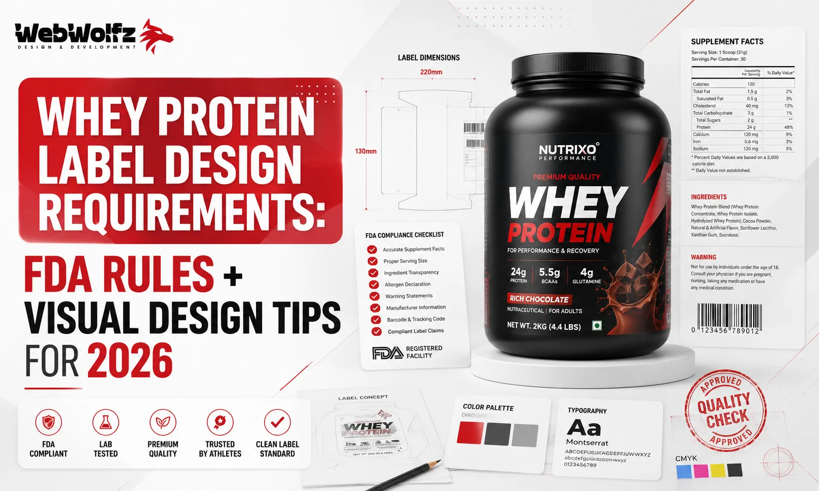
If you are launching a whey protein brand in 2026, your label is doing two jobs at the same time. One, it is a legal document that must satisfy FDA regulations down to the font size and panel format. Two, it is a salesperson standing silently on a shelf, competing with dozens of other tubs and pouches. Getting either of these wrong will cost you, whether that is a regulatory recall or a customer scrolling past your product without a second look.
This guide covers both sides clearly. We walk through every FDA-mandated element your whey protein label must have, explain why each one matters, and then move into the visual design principles that actually make a label perform. Whether you are designing your first protein powder or relaunching an existing brand, this is the reference you need before anything goes to print.
One thing to understand upfront: whey protein labels are not all governed by the same set of rules. How your product is classified determines which panel format you use. A protein powder marketed as a dietary supplement needs a Supplement Facts label listing its key ingredients, like whey protein isolate and added vitamins. However, a ready-to-drink protein shake, classified as a conventional food, needs a Nutrition Facts panel because it is consumed as a food product rather than a dietary supplement. Most tubs and pouches of whey protein fall under dietary supplement rules, so the Supplement Facts format applies, and that is what most of this guide focuses on.
What FDA Mandates on Every Whey Protein Label
The FDA requires seven specific items on every dietary supplement label. They must appear in the right place, in the right type size, and in the right order. Missing even one of these can result in your product being considered misbranded, which carries real consequences.
Statement of Identity
The statement of identity includes the product name and the words “dietary supplement” (or a more specific term). It must appear on the principal display panel, which is the front of the package. This tells the customer and the FDA exactly what the product is. For a whey protein product, something like “Whey Protein Isolate — Dietary Supplement” placed clearly on the front panel is the standard approach. Many brands make the mistake of letting the product name dominate the front without including the required identity statement.
Net Quantity of Contents
The net quantity must appear on the lower portion of the principal display panel. It shows how much product is in the package and must be expressed in both metric and US standard units. For a 2-pound tub of whey protein, both “2 lb” and “907 g” need to appear. This is a detail that often gets overlooked in early design mockups.
Supplement Facts Panel
This is the most detailed mandatory element. The Supplement Facts panel format must match 21 CFR 101.36 exactly, including type size and ingredient order, not just that the numbers are correct. For whey protein specifically, the protein declaration follows specific rules. The declaration of protein only applies when the supplement contains intact, functional protein such as a whey or plant-based protein powder. Protein must be listed in 1-gram increments under the rounding system FDA requires.
The serving size must be stated clearly and must reflect a realistic, single-use amount. Manipulating serving size to inflate the per-serving protein number is a practice the FDA and consumer watchdog groups watch closely. Consumer Reports’ October 2025 testing of protein powders flagged products for exceeding lead levels of concern, and a class action was filed in July 2026 alleging undisclosed heavy metals in a protein powder sold at a major retail chain. Inaccurate or misleading label data has become a serious liability issue in 2026.
Ingredient List
Every ingredient must be listed in descending order of predominance by weight. Whey, concentrated whey, reconstituted whey, and dried whey may all be declared simply as “whey” under FDA ingredient naming rules. Whey protein concentrate and whey protein isolate should be named specifically and accurately. Flavoring agents, sweeteners, and any fillers must all be listed. Leaving out an ingredient or mislabeling a source is a compliance risk.
Allergen Declaration
Whey is derived from milk, which makes it a major allergen under the Food Allergen Labeling and Consumer Protection Act. Whey protein concentrate and whey protein isolate are milk-derived, and the milk allergen must be declared parenthetically or in a “Contains:” statement. If your product is manufactured in a facility that also handles tree nuts, soy, eggs, or sesame, cross-contact advisory language may also be required.
Manufacturer or Distributor Information
The name and address of the manufacturer, packer, or distributor must appear on the label. If you are selling a private-label product, the entity whose name goes on the label takes legal responsibility for its accuracy. The brand owner carries final responsibility, and every word and image counts. The cost of compliance is always lower than the cost of a recall.
If your label makes any claim about how the product affects the body (for example, “supports muscle recovery” or “helps increase strength”), a DSHEA disclaimer is required. The supplement facts label must include a disclaimer at the bottom if any structure/function claims are made. The standard disclaimer text is: “These statements have not been evaluated by the Food and Drug Administration. This product is not intended to diagnose, treat, cure, or prevent any disease.” This text must appear in a specific size and placement relative to the claim.
A Note on Heavy Metals and California Prop 65
A supplement can legally be sold with heavy metal levels above the Prop 65 threshold, but only with the required warning label attached. Selling into California without one, when your product’s actual metal content would require it, is a serious legal exposure. If you sell nationally, this is not a California-only concern. Retailers increasingly ask for third-party heavy metal test results before listing a supplement.
If you are also designing labels for related protein-based products, our guides on protein shake packaging design and protein drink packaging design cover the compliance nuances for ready-to-drink formats where Nutrition Facts rules apply instead.
Visual Design Tips for Whey Protein Labels in 2026
Once you have compliance locked in, design becomes the competitive layer. The supplement aisle, whether physical or digital, is crowded. A label that looks like every other tub will not create the brand recognition that drives repeat purchases. Here is what actually works in 2026.
Lead with a Clear Visual Hierarchy
Establishing a clear hierarchy of information through thoughtful typography is essential: your brand name and product type should be the largest and most visible elements. Use no more than two to three complementary fonts to maintain visual coherence while creating clear distinction between different types of information. A common mistake is using four or five fonts across different label panels, which creates visual noise that undermines trust.
Your product name should instantly communicate your key value proposition. Consider how descriptive elements help differentiate variants, for example “Ultra Premium Whey Isolate” versus “Plant-Powered Protein Blend.” This is especially important on e-commerce product pages where the thumbnail is small and the customer is deciding in under two seconds whether to click.
Minimalism Is Still Winning
The most significant trend in whey protein powder packaging design in 2026 is minimalism. Consumers are more drawn to clean designs that highlight crucial information. Minimalism in color palette, typography, and layout creates a sophisticated look that resonates with health-conscious consumers who prefer a straightforward design presentation.
This does not mean boring. It means intentional. Every element on the label should earn its space. If a graphic is not communicating something, it is competing with something that is. White space is not wasted space.
While it may be tempting to fill every inch of your label with information, strategic white space enhances readability and gives your design a more premium feel. Allow key elements room to breathe, especially your logo, product name, and primary benefit statements.
Color Strategy for Differentiation
Always ensure your typography is legible, and use contrasting colors to create a visual hierarchy. The more precise your messaging, the more likely customers will feel confident about choosing your product.
Color also serves a functional role in multi-SKU lines. If you have five flavors of whey protein, using a distinct color per flavor while keeping all other brand elements consistent makes it easy for a customer to grab the right one without reading every label. This kind of system-level thinking is something many brands only figure out after launching, usually when they realize their chocolate and vanilla variants look almost identical from three feet away.
Front Panel vs. Back Panel: Know What Goes Where
The front of your whey protein label should be reserved for the most critical information, such as the product name and tagline. The back can be kept for ingredients, nutritional facts, and usage guides. FDA-mandated panels like the Supplement Facts and ingredient list belong on the back or side, but they should still be designed, not just dropped in as an afterthought. Legible panel fonts, proper contrast against the background, and a clean layout within the mandated format all affect consumer trust and FDA compliance at the same time.
Benefit Claims Should be Front and Prominent
The visual system should emphasize clarity, freshness, and energy, with strong focus on key claims such as “20g protein” or “zero fat” in a clean and easy-to-read layout. The design system should be fully adaptable across multiple flavors, ensuring brand consistency while allowing flexibility for product line extensions.
Consumers scan labels looking for a number: how many grams of protein per serving. Make that number large and impossible to miss. Everything else supports it.
Consistency Across Packaging and Digital
Ensure key brand elements remain consistent between packaging and digital platforms, and consider how your label will appear in consumer-generated content. Your product will be photographed, shared on Instagram, reviewed on YouTube, and screenshotted for WhatsApp. A label that photographs well is no longer a nice-to-have.
If you are working across multiple product categories, it helps to look at how similar brands handle this across formats. Our whey protein label design guide for Indian brands covers market-specific considerations in more detail, and if you are wondering why so many Indian brands end up looking similar, the answer is explored in depth in our piece on why Indian whey protein brands look the same.
For brands extending beyond protein into adjacent categories, the design principles translate well. The same hierarchy and compliance logic applies whether you are working on hydration powder packaging design, electrolyte powder packaging design, or protein snacks packaging design.
Common Mistakes Brands Make with Whey Protein Labels
Understanding what to avoid is just as useful as knowing what to do. These are the most frequent errors that result in either FDA issues or poor market performance.
Using Unsubstantiated Claims
Words like “clinically proven,” “scientifically tested,” or “the best protein in India” are either disease claims or comparative superiority claims. Both categories carry specific FDA and FTC requirements. If you cannot substantiate the claim with actual study data that meets regulatory standards, do not put it on the label. This is one of the primary reasons brands get warning letters.
Incorrect Font Size in Supplement Facts Panel
The Supplement Facts panel format must match 21 CFR 101.36 exactly, including type size. The minimum type size for the panel is 6 points. Many designers reduce the font below this threshold to make the panel fit a small label surface. This is a compliance violation even if the numbers are otherwise accurate.
Forgetting the DSHEA Disclaimer Near Claims
Brands often place the structure/function disclaimer at the very bottom of the label in a location disconnected from the actual claim. FDA requires the disclaimer to appear in conjunction with the claim. If the claim appears on the front panel, the disclaimer needs to appear in close proximity.
Treating the Label as a Design-First, Compliance-Second Project
This is the root cause of most problems. A label designed entirely around aesthetics and then handed to a regulatory consultant for “sign-off” almost always comes back with requested changes that break the layout. The better approach is to build compliance into the design brief from the start, knowing which panels are mandatory, what minimum sizes apply, and where each element must live before the designer starts working.
Not Designing for the Container Shape
A label that looks great as a flat file may wrap awkwardly around a cylindrical tub or lose readability at the seam of a standup pouch. Always proof labels on the actual container, in three dimensions, before finalizing the artwork.
For brands designing across a wider range of supplement or snack formats, it is worth studying how design decisions change across different substrates. From protein dessert packaging design to protein brownie packaging design to collagen water packaging design, each format has its own surface constraints and consumer expectations.
Why Getting This Right from Day One Matters
The supplement space is more scrutinized than it has been in years. Brands that work with a GMP-certified manufacturer handling label design in-house get a clear advantage because artwork moves through the same compliance review used for production records, and catches happen earlier. Waiting until launch week to discover a compliance issue means either delaying your launch or going to market with a label you know has problems.
The visual side matters equally. A product that passes every FDA check but sits invisibly on a crowded shelf achieves nothing. In an increasingly competitive supplement market, whey protein label design requirements are the floor, not the ceiling. Your design needs to clear compliance and still create desire.
A lot of brands underestimate how much goes into getting both of these right simultaneously. That is exactly where working with a specialist packaging design agency changes the outcome. WebWolfz works specifically with food and supplement brands on packaging design that is built to be both compliant and visually compelling. If navigating FDA rules, allergen declarations, Supplement Facts formatting, and visual hierarchy all at once sounds like more than you want to manage internally, that is what we are here for. You can reach out to WebWolfz here to discuss your label project.
Our team has worked on everything from protein muffin packaging design to hydration drink packaging design, and the underlying discipline of marrying compliance with strong visual design is consistent across every format. If you are still deciding what kind of agency to work with, our guide on how to choose a packaging design agency in India lays out exactly what to look for.
FAQ
What are the mandatory elements on a whey protein label under FDA rules?
Every whey protein dietary supplement label must include a statement of identity with the words “dietary supplement,” the net quantity of contents, a Supplement Facts panel formatted to 21 CFR 101.36, a complete ingredient list in descending order of weight, allergen declarations (milk, at minimum, for whey), the name and address of the manufacturer or distributor, and a DSHEA disclaimer if any structure/function claims appear on the label.
Does a whey protein label need a Supplement Facts or Nutrition Facts panel?
It depends on how the product is marketed. Whey protein powders sold as dietary supplements use a Supplement Facts panel. Ready-to-drink protein shakes classified as conventional food use a Nutrition Facts panel. Most tubs and pouches of protein powder fall under the supplement category and therefore require the Supplement Facts format.
Can I make claims like “builds muscle” or “supports recovery” on my whey protein label?
Yes, these are considered structure/function claims and are allowed on dietary supplement labels. However, they require a DSHEA disclaimer stating the claim has not been evaluated by the FDA and the product is not intended to treat or prevent disease. The disclaimer must appear in close proximity to the claim, not just buried at the bottom of the label.
What font size is required for the Supplement Facts panel?
FDA regulations under 21 CFR 101.36 require a minimum 6-point type size within the Supplement Facts panel. Reducing the font below this threshold to fit a smaller label is a compliance violation regardless of whether the nutritional data itself is accurate.
Do I need to declare allergens on a whey protein label?
Yes. Whey is derived from milk, which is a major allergen under US law. The milk allergen must be declared either parenthetically within the ingredient list or through a “Contains: Milk” statement. If your product is manufactured in a facility that handles other major allergens like soy, tree nuts, eggs, sesame, or wheat, cross-contact advisory statements may also be appropriate.
What is the biggest design mistake whey protein brands make?
The most common mistake is treating compliance and design as two separate steps: designing the label for aesthetics first and then trying to fit mandatory elements in afterward. This almost always breaks the layout or creates compliance gaps. The right approach is to integrate FDA requirements into the design brief from the beginning, so the visual design and legal requirements are developed together, not in conflict.
How do I make my whey protein label stand out on shelves and online?
Focus on three things: a clear visual hierarchy that makes your protein count and product name instantly readable, a color strategy that differentiates flavors within a consistent brand system, and enough white space so the label feels premium rather than cluttered. Minimalism continues to outperform busy designs in the supplement category in 2026. And always proof the label on the actual container shape before finalizing.