

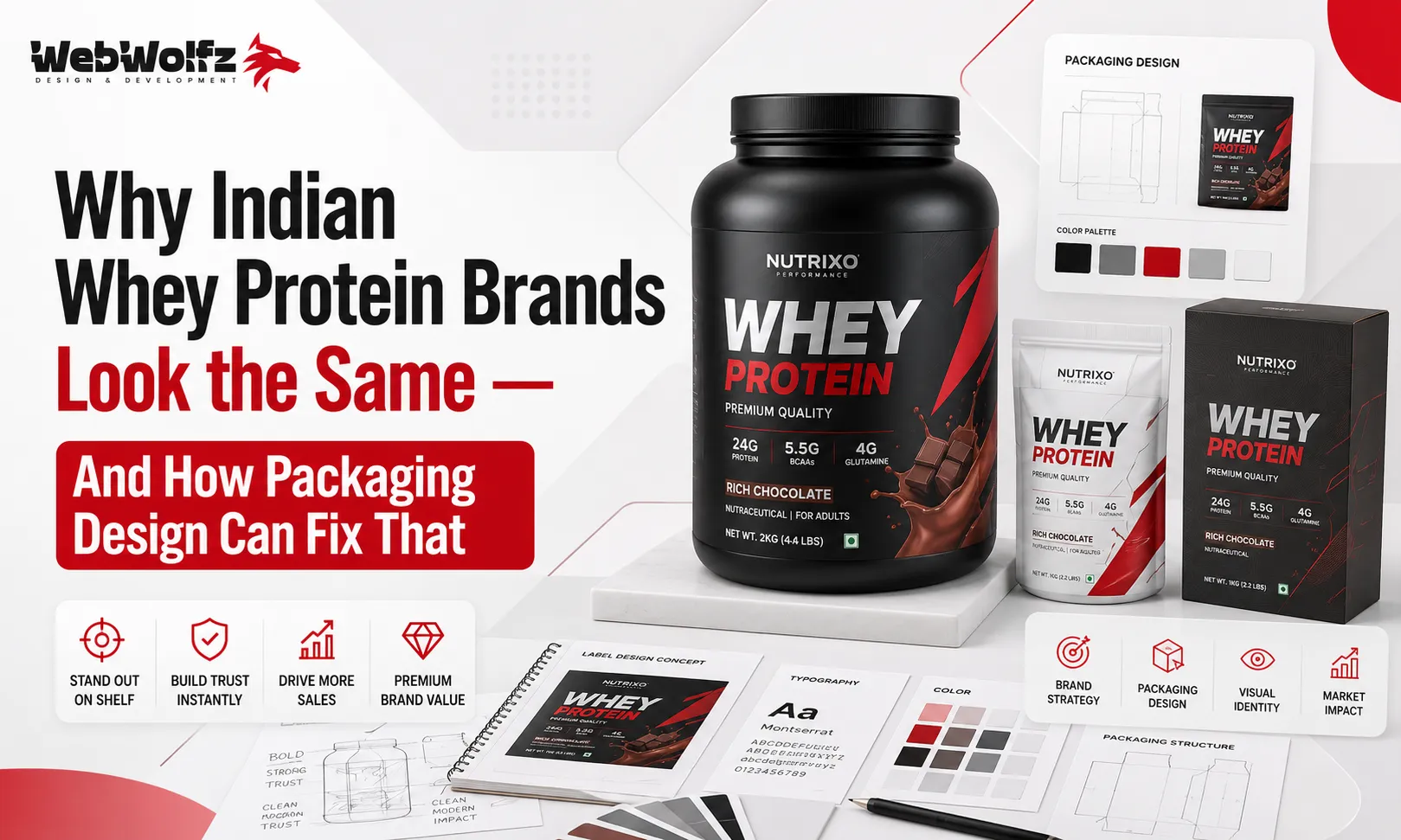
Walk into any gym supplement store in Delhi, Mumbai, or Bengaluru right now and do a simple experiment. Stand in front of the whey protein shelf and try to tell the brands apart without reading the name. Chances are, you will struggle. Dark background, usually black or navy. A muscular male silhouette or an abstract lightning bolt. Bold all-caps font screaming something like “MASS” or “POWER” or “PRO.” Protein grams in a huge number slapped right in the center. Metallic accents that look more like a gaming energy drink than a premium nutrition product.
This is not a coincidence. This is a pattern, and it has become one of the biggest invisible problems in the Indian supplement industry. The market for whey protein in India is growing at a rapid pace, with millions of new gym-goers entering the fitness lifestyle every year. Yet if you scroll through any Indian e-commerce page selling whey protein, the visual experience is almost identical across twenty different brands. They all borrow from the same visual language, one that was arguably set by imported American brands from the early 2000s, and nobody has questioned it since.
The result is a shelf full of products where consumers cannot distinguish one brand from another based on design alone. And that is not just a branding problem, it is a business problem. Because in a market this crowded, the brand that looks different gets noticed first. The brand that gets noticed first gets picked up first. And the brand that gets picked up first earns the sale, even before the customer reads a single ingredient.
This blog breaks down exactly why this sameness happens, what it costs Indian supplement brands, and how thoughtful whey protein packaging design in India can completely change the game.
Why Every Indian Whey Protein Tub Ends Up Looking the Same
The reasons behind this design monotony are more practical than creative. Most new supplement brands in India start as white-label or OEM products. They pick a manufacturer, choose a flavour stack, and then hand the packaging brief to either a freelancer or a low-cost design shop with a simple instruction: “make it look premium, make it look strong.” Since both the brand owner and the designer are drawing inspiration from what is already on the shelf, the output naturally becomes a variation of what already exists. Dark colours because dark means “serious.” Muscles because muscles mean “it works.” Big protein numbers because numbers sell. And just like that, another clone enters the market.
There is also an industry-wide assumption that the Indian gym consumer responds only to power aesthetics. That assumption made sense when the primary buyer was a male bodybuilder in his twenties who shopped at a physical supplement store. But the Indian fitness consumer in 2025 and beyond looks completely different. Women now make up a significant and growing share of the supplement market. So do office professionals, runners, yoga practitioners, and people simply trying to manage their protein intake without stepping into a gym at all. These buyers do not respond to the aggressive dark-and-bold visual formula. They want something that feels clean, credible, and aligned with their lifestyle.
The industry has not caught up with this shift. And the brands that do catch up first will have a significant advantage, not just on aesthetics, but in actual market share.
Another reason for this visual sameness is the lack of investment in professional packaging strategy. Many brands treat packaging as the last step in the launch process rather than the first. The formulation gets attention, the pricing gets attention, the marketing channels get attention, but the packaging often gets rushed. And rushed packaging always defaults to safe, familiar territory, which means it defaults to looking exactly like everyone else.
If your brand is launching a new whey protein or thinking about redesigning your current packaging, reading about whey protein label design in India before briefing a designer can save you from making the same expensive mistake most brands make.
What Generic Packaging Actually Costs Your Brand
The cost of looking like everyone else is not just aesthetic. It is financial and strategic. When two products look nearly identical on a shelf or on a product listing page, the buyer defaults to price comparison. They will pick the cheaper option because they perceive no meaningful difference between the two. This drives the entire category into a race to the bottom on pricing, which kills margins and stunts brand growth.
Generic packaging also destroys brand recall. A customer who buys your protein once and likes it should remember your brand the next time they are shopping. But if your tub looks like six other tubs they have seen, they cannot pick you out from memory. They end up searching generically, finding whoever ranks higher or runs better ads that day, and buying from them instead. The cost of customer acquisition just went up because your packaging failed to create a lasting visual impression.
There is also the trust problem. India has a well-documented issue with adulterated and mislabelled protein supplements. Studies have shown that a significant percentage of Indian protein products do not match their label claims. In this environment, consumers are actively looking for signals of credibility, transparency, and brand seriousness. A thoughtfully designed package with clear ingredient communication, clean typography, and a professional layout signals that the brand behind it takes its product seriously. A generic dark tub with a stock muscleman image signals the opposite.
This is precisely where packaging design stops being an aesthetic decision and becomes a trust-building tool. The way your label is designed tells the consumer whether you are a serious brand or just another generic product that filled a tub and stuck a label on it.
For brands that are expanding beyond whey into the wider supplement and functional food space, this trust problem compounds. A brand that looks generic in whey protein will also look generic in protein shakes, protein drinks, electrolyte powders, or hydration powders. Inconsistent or generic visual identity across a product portfolio makes scaling almost impossible.
What Great Packaging Design Actually Does for a Supplement Brand
Great packaging design does not just make a product look nice. It does a very specific job at the moment of purchase, which is the most critical moment in the entire customer journey. It stops the scroll, communicates a brand personality instantly, and makes the buyer feel confident enough to pick it up or click “add to cart.”
For Indian whey protein brands specifically, here is what well-executed packaging design achieves. First, it creates immediate shelf differentiation. If every competitor uses black and aggressive typography, a brand that uses a clean white or muted tone with strong structural layout will stand out completely. Not because it is “better looking” in some abstract sense, but because it is visually different, and different gets noticed. This principle applies equally to food packaging design across categories, where the boldest visual contrast on the shelf almost always wins attention first.
Second, good packaging communicates the brand’s positioning without a single word of marketing copy. A clean label with clear ingredient transparency communicates quality. A playful typographic palette communicates approachability. An earthy, muted colour story communicates naturalness. The right design system does this positioning work passively, every single time a consumer looks at the shelf, which is something even the best social media campaign cannot replicate.
Third, strong packaging builds a visual system that scales. When your whey protein tub has a clear design language, your protein snacks packaging, your protein brownie packaging, your protein cookie packaging, and even your hydration drink packaging can all speak the same visual language. A consumer who recognises your brand on the shelf in one category will trust it immediately in another. That is how packaging design becomes a long-term growth asset rather than a one-time expense.
Internationally, brands like Momentous, Form Nutrition, and Ritual have proven that supplement packaging does not have to be loud to be premium. Ritual in particular built its entire brand identity around radical transparency. Clear capsules, a clean white design system, visible ingredient sourcing. The packaging itself became the trust signal, and it differentiated Ritual in a completely overcrowded market without spending millions on traditional advertising. Indian brands have every reason to take notes.
How Indian Whey Protein Brands Can Fix Their Packaging
The fix is not about spending more money on fancier printing or using metallic foils everywhere. It starts with strategy, specifically with understanding who your customer actually is and what they want to feel when they hold your product.
Start with your target audience, not your competitors. Most Indian supplement brands design by looking at what their competitors have done. The smarter approach is to start with a deep understanding of the buyer persona. Is your core customer a competitive athlete, a working professional, a woman in her thirties managing her protein intake? Each of these buyers responds to a completely different visual language. An athlete might want performance cues. A professional might want clean minimal design. A female buyer in the health-conscious segment might want warmth and approachability. Your packaging should be designed for your buyer, not for your competition.
Next, invest in a proper brand identity before designing the packaging. The label is the output of the brand, not the starting point. Before a single colour or font is chosen, your brand needs a defined personality, a visual direction, and a positioning statement. What does your brand stand for that no one else is saying clearly? If you can answer that in one clear sentence, you have the foundation for packaging that will differentiate you on the shelf.
Typography is also massively underrated in Indian supplement branding. The all-caps slab serif font with aggressive tracking has become as generic as the dark background. Brands that use distinctive, well-considered type choices immediately signal a higher level of craft and intentionality. This applies not only to large tubs but to every format in a portfolio, from protein dessert packaging to energy gel sachets to protein muffin packaging.
Colour strategy deserves its own conversation. The Indian supplement market is largely dark. Which means that any brand willing to explore lighter, more considered palettes has an immediate and almost automatic shelf differentiation advantage. This does not mean going fully pastel or losing the sense of performance that protein buyers expect. It means finding a colour story that is yours and yours alone. A brand in the electrolyte drink space or the collagen water segment that builds a distinctive colour system will be remembered long after the customer has finished the product.
Label layout and information hierarchy also matter more than most brands realise. Indian consumers are increasingly educated about ingredients. They read labels before buying. A label that presents nutritional information in a clear, readable, honest format builds trust. A label that buries the important information under design noise loses trust. If you want to understand how information hierarchy and label design work together effectively, checking out how leading agencies approach packaging design services for food brands can give you a solid foundation.
Now here is the honest truth for most supplement brand owners. Building a differentiated packaging design system from scratch requires expertise across brand strategy, typography, colour theory, print production, and FSSAI compliance. It is not a freelancer weekend project. It is a considered, research-led process that results in packaging that genuinely works in the market. If you are spending months building the right formula and a serious distribution network, it makes no sense to cut corners on the thing that consumers see first and judge fastest.
This is where working with a professional packaging design agency makes the most practical sense. Knowing how to choose a packaging design agency in India that actually understands supplement brand positioning and retail realities can save you from launching with packaging that looks like your nine nearest competitors.
WebWolfz has worked with food and supplement brands across India to create packaging that does not just look different but actually performs in the market. Whether it is a whey protein tub, a protein cake, a snack product aimed at fitness-conscious buyers, or a functional coffee, the approach is always the same: understand the brand deeply, understand the buyer honestly, and build packaging that earns trust from the very first glance. If your supplement brand is ready to stop looking like everyone else, WebWolfz is a good place to start that conversation.
The Indian whey protein market is only going to get more crowded in the next three to five years. More brands will launch, more white-label products will fill the shelves, and the noise will only increase. The brands that invest in genuine visual differentiation today will not just look better tomorrow. They will own a recognisable space in the consumer’s mind that no amount of discounting can buy away.
Packaging design is not decoration. It is the first conversation your brand has with every potential customer. Make it count.
Frequently Asked Questions
Why do most Indian whey protein brands look so similar in packaging?
Most Indian supplement brands launch as white-label or OEM products and brief designers to match what is already on the shelf. This creates a copy-of-a-copy effect where every new brand ends up using the same dark backgrounds, bold fonts, and power-themed imagery that existing brands use. The absence of a defined brand identity before packaging design begins is the root cause of this sameness.
Does packaging design actually affect whey protein sales in India?
Yes, significantly. When two products are visually similar on a shelf or an e-commerce listing, the buyer defaults to picking the cheaper option because they see no meaningful difference. Better packaging creates shelf differentiation, communicates brand positioning, builds trust, and improves brand recall, all of which directly impact sales and repeat purchases.
What makes whey protein packaging design stand out on the shelf?
The most effective differentiators are a distinctive colour palette that does not follow the generic dark formula, typography that reflects a clear brand personality, clean and honest information hierarchy on the label, and a consistent visual system that works across the full product range. Differentiation is earned through strategy, not just aesthetics.
How much should an Indian supplement brand invest in packaging design?
There is no single correct number, but treating packaging design as a one-time cheap task is the most common and most costly mistake supplement brands make. Professional packaging design that includes brand strategy, label design, FSSAI-compliant layouts, and print-ready production files is an investment that pays back every time a consumer sees your product on a shelf or a screen.
Should a startup whey protein brand work with a packaging design agency?
If budget allows, yes. A packaging design agency that understands the Indian supplement market, FSSAI compliance requirements, and retail shelf dynamics will produce work that a generalist freelancer typically cannot. For brands serious about building a long-term supplement business, professional packaging strategy is not optional, it is foundational.
Can the same packaging design language work across a supplement product portfolio?
Absolutely, and this is one of the biggest advantages of investing in a proper brand identity first. A well-built visual system for your whey protein can extend naturally to protein bars, protein snacks, hydration powders, and functional foods. Consistent visual language across a product portfolio builds stronger brand recognition and makes retail expansion significantly easier.