

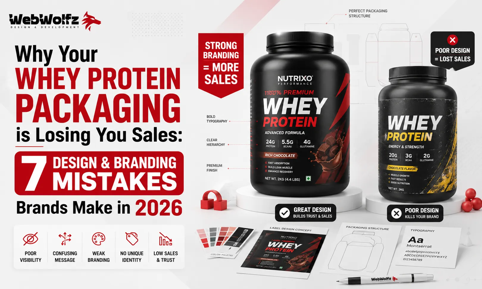
Walk into any sports nutrition store or scroll through any supplement marketplace today and one thing hits you immediately. There are hundreds of whey protein products, and most of them look exactly the same. Dark background, a muscular silhouette, bold sans-serif font screaming the gram count, and a flavor name buried somewhere at the bottom. If your brand is doing the same thing in 2026, there is a very real chance that your packaging is quietly killing your sales before a single customer even reads your label.
The Indian and global protein supplement market is growing at a pace nobody expected. Brands like Ghost, Myprotein, OZiva, and Form Nutrition are showing that ingredient transparency and community-driven whey protein branding and packaging can outgrow legacy players at two to three times the speed when done right. The brands that are winning are not necessarily the ones with the best formula. They are the ones whose packaging builds instant trust, communicates clearly, and looks premium enough for someone to put in their cart without hesitation. The brands that are losing are the ones treating packaging as an afterthought.
If your sales have plateaued, your repeat purchase rate is low, or your product simply is not getting picked up on shelves or getting clicked on D2C platforms, the problem might not be your product. It might be your packaging. Here are the seven most common and most costly mistakes that whey protein brands make in 2026.
Mistake 1: Your Packaging Looks Like Every Other Brand on the Shelf
This is the number one reason brands fail to convert, and it is also the most overlooked. When you design your protein tub or pouch to look like the category leader, you are not building brand equity. You are building confusion. A customer glancing at a shelf for three seconds is not going to stop and read your label if it looks like a generic version of something they already know. As we covered in detail in our piece on why Indian whey protein brands look the same, the problem is not just aesthetic. It is a strategic failure to differentiate.
The supplement category in 2026 is flooded with dark-colored tubs, aggressive typography, and muscle imagery that has been recycled since the early 2000s. Brands that are breaking through are doing the opposite. They are using clean layouts, thoughtful color blocking, and a visual identity that feels fresh without being gimmicky. If your product could have been made by any of your five direct competitors with a label swap, you have a serious problem.
The fix is not to chase a completely alien aesthetic. It is to develop a genuine brand language, from your color palette to your iconography to the tone of your copy, and to apply it consistently across every SKU. Your packaging should be unmistakably yours.
Mistake 2: Cluttered Front Panel with No Visual Hierarchy
One of the most common issues in whey protein packaging design is trying to say everything on the front panel. Brands list the protein grams, the calorie count, the BCAA ratio, the digestive enzymes, the third-party certifications, and the flavor, all fighting for attention on a surface that often measures less than 15 centimeters across. The result is a label that overwhelms and confuses instead of selling.
Research consistently shows that shoppers make purchase decisions in a matter of seconds. If your front panel does not communicate your core value proposition instantly, you lose them. The job of the front panel is not to educate. It is to create desire and build enough curiosity that the customer picks up the product. The back panel, the QR code, and your website exist to educate. Good packaging design is about knowing what goes where.
The solution is a clear visual hierarchy. Lead with your brand name, follow with your key claim (for example, 25g protein per serving or zero added sugar), add the flavor prominently, and let white space do the rest. Everything else belongs on the secondary panels. This is the same principle that drives strong food packaging design across every category, from protein snacks to hydration powders.
Mistake 3: Poor Typography Choices That Undermine Trust
Typography is one of the most underestimated tools in packaging design. The font choices you make signal something to every customer who sees your product. A mismatched, overly decorative, or hard-to-read typeface does not just look unprofessional. It actively erodes trust. In the supplement space especially, where customers are putting something in their bodies and trusting a brand with their health, trust signals matter enormously.
Many emerging protein brands use free fonts, mix three or four typefaces on the same label, or pick display fonts that look great on a screen but become illegible at small sizes on the actual container. Low contrast between the text and background is another frequent mistake. A vibrant gradient background with white text in a thin font weight is nearly impossible to read under store lighting.
Professional supplement label design uses a maximum of two complementary typefaces, applies them with clear intention across hierarchy levels, and always tests legibility in physical print conditions. Whether you are designing a protein shake packaging or a classic protein powder tub, your typography has to work at every size, in every lighting condition, and in every color context.
Mistake 4: Ignoring FSSAI and Regulatory Label Requirements
This one can cost you more than just sales. It can cost you your entire batch. Brands launching in India routinely underestimate how specific and non-negotiable the FSSAI labeling requirements are for protein supplements. The product name, net quantity, nutritional information panel, ingredient declaration, allergen statements, batch number, manufacturing date, FSSAI license number, and manufacturer address all need to appear in the right format, at the right size, in the right panel position.
A label that is not compliant can result in products being pulled from shelves, rejected by e-commerce platforms, or flagged during inspections. We have written a detailed breakdown of exactly what whey protein label design requirements look like in India and how brands can stay compliant without sacrificing design quality. Missing even one element can set your launch back by weeks and cost you significantly in reprinting and reformatting.
The mistake most brands make here is handing off the compliance checklist to the printer or the manufacturer and assuming it will be handled. It will not. Compliance has to be built into the design process from the very beginning, not bolted on at the end.
Mistake 5: Choosing the Wrong Color Psychology for Your Target Buyer
Color is not decoration. In packaging, color is communication. The palette you choose tells a customer whether your product is for serious athletes, casual gym-goers, or health-conscious everyday consumers. It signals whether your brand is premium, mass-market, or science-backed. Choosing the wrong colors for your audience is like running the wrong ad to the wrong demographic. You might get impressions, but you will not get conversions.
Brands targeting competitive athletes often use bold, high-contrast colors like black, red, or electric blue. Brands targeting the wellness and lifestyle crowd are increasingly moving toward cleaner, softer palettes with earthy tones and muted greens that feel more approachable and less intimidating. Brands targeting women in fitness are finding success with sophisticated neutrals and pastels rather than the default dark-and-aggressive aesthetic.
The problem arises when brands pick colors based on personal preference, what a competitor is using, or simply what looked good on screen, without ever thinking about whether those colors speak to the actual buyer they want to reach. A useful exercise is to look at your top five competitors and then deliberately ask: what color would make a buyer notice us first and feel something different? That answer should drive your palette decisions. You can see how this plays out across different products by looking at protein snacks packaging design and protein dessert packaging design, where the color language varies dramatically based on audience intent.
Mistake 6: Packaging That Looks Great in Person but Fails on E-Commerce
In 2026, a significant portion of supplement sales happen online. Whether it is your own website, Amazon, or a platform like Healthkart or Flipkart, your packaging has to perform well in thumbnail format. This is an entirely different design challenge than shelf visibility, and most brands do not design for both simultaneously.
A label that looks luxurious in person can appear muddy, complex, or indistinct as a 200×200 pixel product image. Fine details, thin typography, and intricate patterns that add depth in physical form can become visual noise in a thumbnail. On e-commerce, the customer’s first impression is entirely based on a small, compressed image. If your packaging cannot communicate your brand and your key value proposition at that scale, you are losing clicks before anyone even reads your product description.
The solution involves designing for both contexts from the start. Think of your label as something that needs to pass two tests: the three-second shelf test and the thumbnail test. Strong contrast, a bold central visual element, and a clean primary color make packaging work harder across both channels. Brands selling protein drinks and protein shakes online have increasingly had to adapt their designs for digital-first visibility, and the same learning applies to powder packaging.
Mistake 7: Inconsistent Branding Across SKUs and Product Lines
The final and perhaps most strategically damaging mistake is inconsistent branding across your product range. When a customer buys your chocolate flavor and then comes back to buy the vanilla, they should be able to identify both products as belonging to the same family at a glance. When your different tub sizes, flavors, or product types look like they were designed by three different agencies with no shared brief, you destroy the brand recognition you have worked hard to build.
Inconsistency shows up in many ways. Different logo placements across flavors. Font weights that shift between SKUs. Color accents that do not follow a system. Completely different visual moods between your protein powder and your protein bar packaging design or your electrolyte powder. Each inconsistency costs you equity. Customers remember brands, not products. If the brand does not look coherent, customers cannot remember it.
Building a proper brand design system before you go into production is not optional. It is the foundation. This means defining your logo rules, your approved color palette, your typography hierarchy, your photography style, and your layout grid, and then applying all of it consistently across every product you ever put on a shelf or a website.
So What Does Good Whey Protein Branding and Packaging Actually Look Like?
Good whey protein branding and packaging in 2026 is clean without being boring. It is differentiated without being confusing. It communicates the right things to the right buyer in the right order. It works on shelves, in thumbnails, in unboxing videos, and in social media posts. It is compliant with regulatory requirements and built on a coherent design system that scales with the brand.
If you want a deeper look at what works specifically in the Indian market, we covered this in detail in our guide on whey protein label design in India. And if you are starting from scratch and want to know how to find the right design partner, our article on how to choose a packaging design agency in India covers exactly what to look for.
The reality is that most founders do not have the time to research competitor packaging, build a brand system, navigate FSSAI compliance, and design for both physical retail and digital commerce simultaneously. That is a full-time job requiring expertise across design, strategy, print production, and regulatory knowledge. Brands that are growing quickly are the ones that stopped trying to handle all of it in-house and partnered with specialists who have done it before.
WebWolfz works with food and supplement brands at every stage, from first launch to product line extensions, helping them develop packaging that actually converts. If you want your product to stop blending in and start standing out, you can get in touch here and talk through what your packaging needs.
Frequently Asked Questions
Q1. Why is whey protein packaging so important for sales?
Packaging is the first thing a potential customer sees, both on a physical shelf and on an e-commerce product listing. In a category as crowded as protein supplements, a customer’s decision to pick up your product or click on it online happens in two to three seconds. If your packaging does not communicate trust, quality, and clarity in that window, the sale is lost regardless of how good your formula is.
Q2. What are the most common whey protein packaging design mistakes?
The most common mistakes include using a cluttered front panel with too much information, copying the visual style of larger competitors, making poor typography choices that reduce readability and trust, ignoring regulatory label requirements like FSSAI guidelines, using colors that do not match the target buyer’s expectations, designing only for physical shelves without thinking about e-commerce thumbnails, and having inconsistent branding across different product SKUs.
Q3. How do FSSAI regulations affect whey protein label design in India?
FSSAI mandates that protein supplement labels in India include specific information such as the product name, net quantity, complete ingredient list, nutritional information panel, allergen declarations, FSSAI license number, batch number, manufacturing date, and manufacturer details. All of this must appear in prescribed formats and minimum font sizes. Non-compliance can result in products being rejected by retailers or e-commerce platforms, or flagged during regulatory inspections.
Q4. How should whey protein packaging be designed for e-commerce in 2026?
E-commerce packaging needs to work at very small image sizes. Designs that use high contrast, a bold central visual element, clean typography, and a strong primary color perform significantly better as product thumbnails than complex or heavily detailed labels. The goal is to communicate the brand identity and the key product claim clearly even in a 200-pixel-wide image.
Q5. How many colors should a whey protein label use?
There is no strict rule, but most successful supplement labels in 2026 work within a palette of two to three primary colors plus one accent color. Going beyond this often results in a label that looks busy and unprofessional. The colors should be chosen based on the target buyer’s preferences and the emotional positioning of the brand, not personal taste or what competitors are using.
Q6. What is the difference between a cluttered label and an informative label?
A cluttered label tries to put everything on the front panel, resulting in visual noise that the customer’s eye cannot navigate quickly. An informative label uses clear hierarchy to lead the customer through the most important information first, such as the brand name, the key benefit claim, and the flavor, while moving detailed nutritional and ingredient information to secondary panels. The front panel’s job is to create interest and desire, not to answer every question a buyer might have.
Q7. Can I handle whey protein packaging design in-house or should I hire a specialist?
You can handle it in-house if you have an experienced brand designer who understands FSSAI compliance, print production specifications, e-commerce optimization, and supplement category conventions. For most early-stage and mid-stage brands, hiring a specialist packaging design agency that has worked in the food and supplement space is a significantly better investment. The cost of redesigning packaging after a failed launch or a compliance issue is almost always higher than getting it right the first time.